Preview image. Unlock full-res
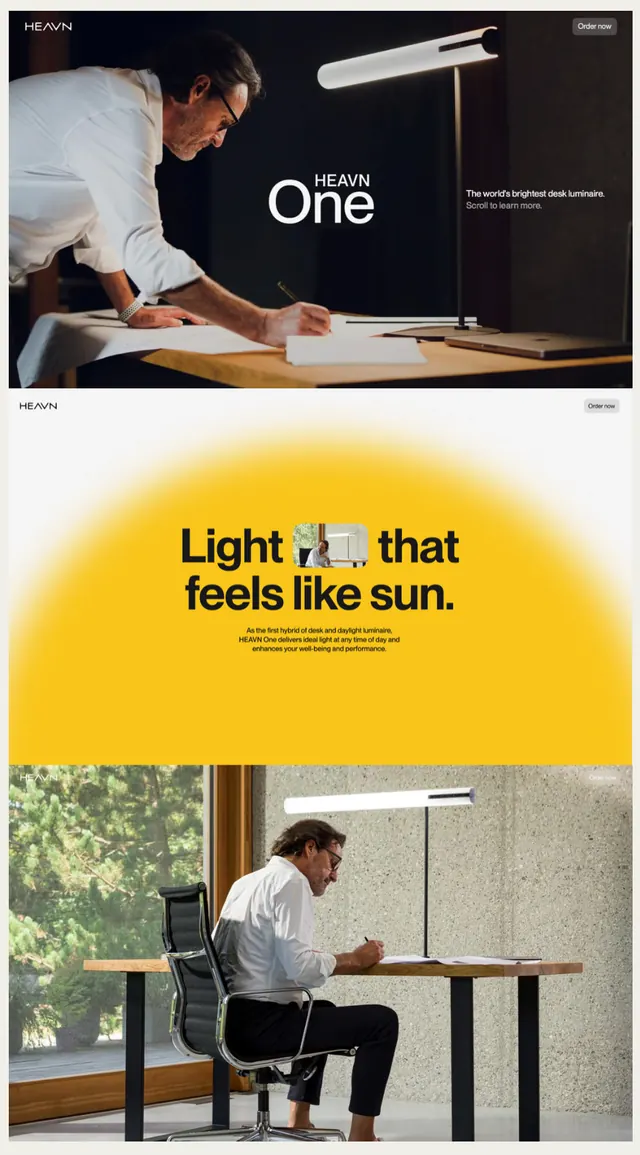
Product landing page for a desk lamp brand using bold color blocking, lifestyle photography, and a humorous headline centered on a bright yellow shape.
Summary
Product page for a minimalist desk lamp brand using a bold yellow circular shape and lifestyle photography to communicate light quality and workspace elegance.
Visual description
Vertical mobile layout. Top: dark hero section showing a man sketching at a desk under the HEAVN One lamp, with the product name and tagline "the world's brightest desk lamp." Middle: a large golden-yellow circle with the headline "Light that feels like sun" in bold black sans-serif, paired with thin descriptive subtext. Bottom: product in context, showing the white desk lamp mounted over a workspace with natural daylight. All imagery favors warmth and professional simplicity, with consistent dark text on light and light backgrounds.
Key takeaway
The centered color-shape (golden circle) acts as both visual anchor and conceptual metaphor for the product's core value. The tight coupling of lifestyle photography with the headline creates narrative cohesion. The typeface treatment (bold sans-serif display on the yellow, sans-serif body) is clean and readable at multiple scales.
Reuse notes
Works well for hardware or consumer-product landing pages where the benefit is experiential (lighting, ergonomics, comfort). The yellow is high-energy without being garish. Pair this pattern with categories like furniture, appliances, or workspace tools where lifestyle context matters as much as specs.
More like this
Keep what you find
A free account saves references to boards and can send you a weekly email of picks based on what you save.
To see every result, go Pro.