Preview image. Unlock full-res
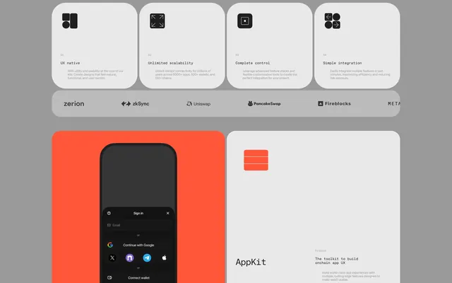
A design showcase featuring feature cards, a partner logo bar, and mobile UI mockups for a developer tool.
Summary
A design showcase featuring feature cards, a partner logo bar, and mobile UI mockups for a developer tool.
Visual description
The layout uses a grid of rounded-corner cards containing black icons and sans-serif text on a light grey background. A bright orange section features a dark mobile UI mockup with 'Sign in' and 'Continue with Google' options. A horizontal bar displays logos for zerion, zkSync, Uniswap, Pancakeswap, Fireblocks, and MATA.
Key takeaway
Use high-contrast icon cards and a distinct accent color to separate feature explanations from product mockups.
Reuse notes
Apply this when presenting technical software capabilities and ecosystem integrations in a clean, modular way.
More like this
Keep what you find
A free account saves references to boards and can send you a weekly email of picks based on what you save.
To see every result, go Pro.