Preview image. Unlock full-res
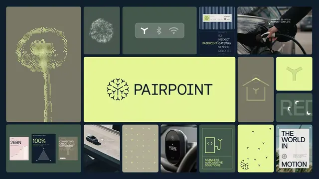
Asymmetric bento-style mood board mixing photography, line art, and illustration in earth tones with a large lime-green centered logo and paired icon/text callouts.
Summary
A bento-grid mood board for an IoT or sensor-tech brand, asymmetrically mixing product photography, line-art illustrations, and neutral lifestyle shots around a large centered lime-green "PAIRPOINT" logo and minimal icon/text pairings.
Visual description
A 4x4+ asymmetric grid layout on a dark navy background. The grid cells contain varied content: a vector leaf/plant icon with delicate dots (top-left), a white geometric network/globe wireframe, minimalist WiFi/signal symbols in olive green, a close-up photo of hands holding a device, a project screenshot, typography specimens saying "REL" and "THE WORLD IS IN MOTION," lifestyle photography of outdoor activities. The center-right area features a large lime-green box with the "PAIRPOINT" logo symbol (a stylized Y-shape) and text below. Each content area uses olive green (#797765), khaki (#AEAC93), lime green (#E4F599), and dark navy as separators. Typography is a clean sans-serif in uppercase for labels. The layout balances geometric/technical illustration (left and upper cells) with photography and branding (right and lower areas), creating a mood of innovation and connectivity.
Key takeaway
The asymmetric bento grid for mood boarding without formal structure. The lime-green logo as a compositional anchor and brand hero in the center-right. The mixing of illustration, icon, and photography styles to convey a multi-sensory brand identity. The olive-and-khaki palette supporting the brighter lime accent.
Reuse notes
Ideal for hardware, IoT, sensor, or developer-tool brands wanting to feel both technical and human. The bento approach works for pitch decks, brand presentations, or web hero sections. The lime accent is punchy against earth tones; consider if your brand can sustain that contrast. Avoid if aiming for a monochrome or muted aesthetic.
More like this







Keep what you find
A free account saves references to boards and can send you a weekly email of picks based on what you save.
To see every result, go Pro.