Preview image. Unlock full-res
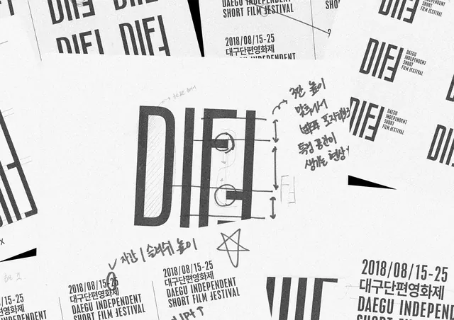
A collection of design sketches and brand identity elements for the Daegu Independent Short Film Festival, showing the evolution of the 'DIF' wordmark.
Summary
A collection of design sketches and brand identity elements for the Daegu Independent Short Film Festival, showing the evolution of the 'DIF' wordmark.
Visual description
The composition features multiple overlapping white sheets showing the 'DIF' wordmark in a heavy, condensed sans-serif typeface. Technical annotations, including measurement lines, handwritten Korean text, and geometric sketches, are layered over the typography. The palette is strictly monochrome, utilizing black ink on a light background.
Key takeaway
Using technical drafting marks and handwritten annotations can add a sense of process and authenticity to a brand identity presentation.
Reuse notes
Use this aesthetic when presenting a brand's developmental phase or when designing for arts and film festivals.
More like this
Keep what you find
A free account saves references to boards and can send you a weekly email of picks based on what you save.
To see every result, go Pro.