Preview image. Unlock full-res
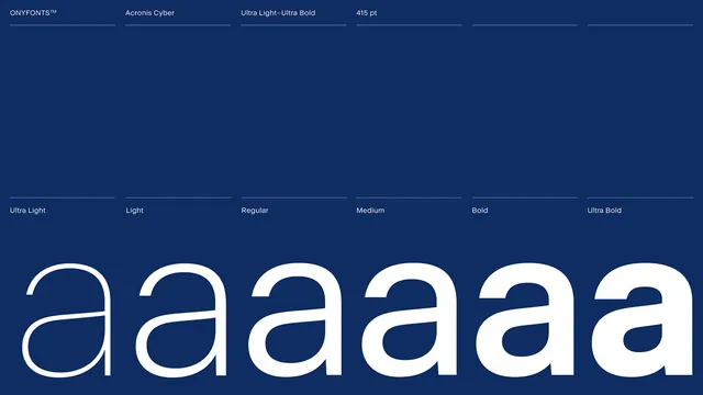
A typographic specimen showcasing various weights of the Acronis Cyber sans-serif typeface against a dark blue background.
Summary
A typographic specimen showcasing various weights of the Acronis Cyber sans-serif typeface against a dark blue background.
Visual description
The layout features a dark navy blue background with white text. The top section displays font names and weights like 'ONYFONTS™', 'Acronis Cyber', 'Ultra Light-Ultra Bold', and '415 pt' in a grid. The bottom section showcases a series of lowercase 'a' characters increasing in weight from 'Ultra Light' to 'Ultra Bold'.
Key takeaway
Using a single character in varying weights provides a clear, immediate visual comparison of a typeface's range.
Reuse notes
Use this layout when presenting a new brand font to stakeholders to demonstrate its versatility and weight distribution.
More like this


Keep what you find
A free account saves references to boards and can send you a weekly email of picks based on what you save.
To see every result, go Pro.