Preview image. Unlock full-res
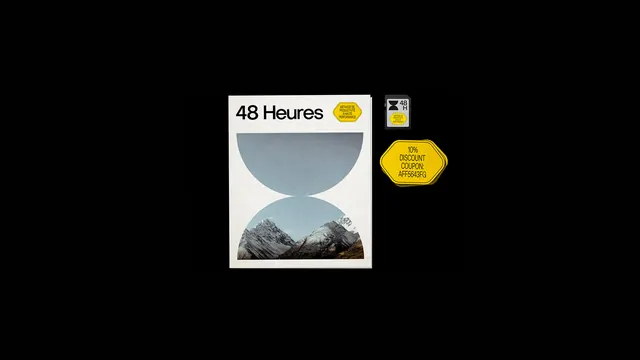
A graphic design layout featuring a central poster with mountain imagery and geometric shapes, accompanied by various yellow hexagonal icons and a small rectangular label.
Summary
A graphic design layout featuring a central poster with mountain imagery and geometric shapes, accompanied by various yellow hexagonal icons and a small rectangular label.
Visual description
A central white poster displays the text '48 Heures' above a blue semi-circle and a mountain photograph, separated by a circular void. Surrounding the poster are yellow hexagonal icons containing text like '10% DISCOUNT COUPOL' and '48 HR', along with a small black and white rectangular label.
Key takeaway
Use geometric shapes and photographic cutouts to create a sense of depth and framing within a minimalist layout.
Reuse notes
Ideal for travel posters, editorial covers, or brand identity systems that require a clean, modern aesthetic.