Preview image. Unlock full-res
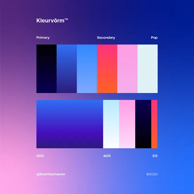
A color palette specification sheet showcasing primary, secondary, and pop color ratios through rectangular blocks and percentage labels.
Summary
A color palette specification sheet showcasing primary, secondary, and pop color ratios through rectangular blocks and percentage labels.
Visual description
The image features a dark gradient background transitioning from purple to blue. It displays two rows of color swatches: the top row shows individual color blocks labeled 'Primary', 'Secondary', and 'Pop', while the bottom row shows a proportional distribution of those colors with percentage labels like '55%', '40%', and '5%'.
Key takeaway
Use proportional color blocks and percentage labels to clearly communicate color distribution and hierarchy in a brand identity system.
Reuse notes
Use this layout when creating brand guidelines or style guides to demonstrate how different colors should be weighted in a design.
More like this





Keep what you find
A free account saves references to boards and can send you a weekly email of picks based on what you save.
To see every result, go Pro.