Preview image. Unlock full-res
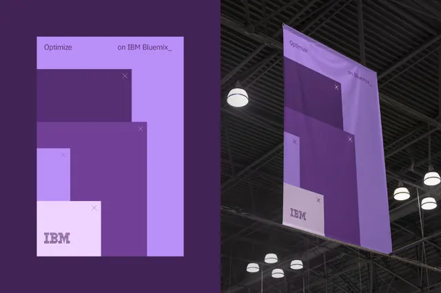
Digital-to-physical brand composition pairing IBM's purple geometric shapes with industrial warehouse photography.
Summary
Brand identity composition merging IBM's purple geometric logo shapes with an isometric cube projection, set against dark industrial warehouse shelving and lighting.
Visual description
Left side shows IBM's iconic bold geometric marks in purple gradients (light lavender to deep violet) on a bright purple background. Right side mirrors the shapes in isometric 3D perspective, receding into dark gray-black warehouse shelving with harsh point lighting (bright white highlights). The IBM wordmark sits white in the upper left of the digital graphic. The composition creates a bridge between flat brand graphics and three-dimensional physical space, suggesting IBM's enterprise software infrastructure runs through real-world systems. The palette stays monochromatic (blacks, whites, purples) with sharp contrast between the bright brand field and dark industrial setting.
Key takeaway
The device of contrasting flat branded geometry with isometric depth to imply scale and infrastructure. Using identical color language (purple gradients) across both dimensions anchors the brand. The harsh warehouse lighting and shadows create sophistication without ornament. This approach works well for B2B tech positioning: "our systems power real infrastructure."
Reuse notes
Effective for enterprise software, cloud, and infrastructure brands needing to convey robustness and scale. The isometric treatment adds technical credibility. The purple-on-dark-gray demands high contrast, so test readability. Best as a brand guideline cover, hero section, or campaign key visual. Avoid for consumer-facing work (too industrial). Requires high-quality photography or illustration to pull off the digital-physical blend.
More like this






Keep what you find
A free account saves references to boards and can send you a weekly email of picks based on what you save.
To see every result, go Pro.