Preview image. Unlock full-res
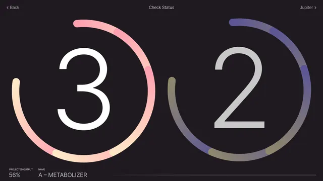
A dark-mode user interface displaying two large numerical progress indicators within circular ring charts.
Summary
A dark-mode user interface displaying two large numerical progress indicators within circular ring charts.
Visual description
Two large, white sans-serif numbers '3' and '2' are centered within thick, gradient-colored circular progress rings. The background is a solid dark color, and the interface includes small white text at the top and bottom edges.
Key takeaway
Use large, oversized typography paired with thick gradient rings to create clear, high-impact visual hierarchy for key metrics.
Reuse notes
Use this layout for high-level status dashboards or countdown screens where immediate numerical clarity is essential.
More like this



Keep what you find
A free account saves references to boards and can send you a weekly email of picks based on what you save.
To see every result, go Pro.