Preview image. Unlock full-res
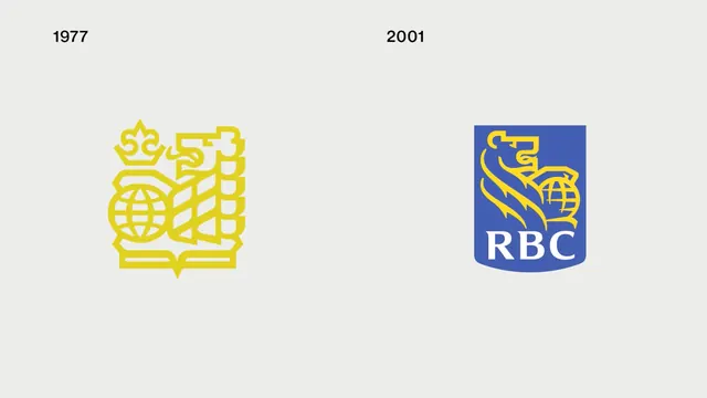
A side-by-side comparison of the Royal Bank of Canada (RBC) logo from 1977 and 2001, showing the transition from a detailed line-art emblem to a simplified, boxed graphic.
Summary
A side-by-side comparison of the Royal Bank of Canada (RBC) logo from 1977 and 2001, showing the transition from a detailed line-art emblem to a simplified, boxed graphic.
Visual description
The image features two logos on a light gray background with dates '1977' and '2001' above them. The 1977 logo is a complex gold-colored line-art illustration of a lion and a castle, while the 2001 logo is a simplified blue and gold emblem with the 'RBC' wordmark.
Key takeaway
The design shows a clear progression toward simplification and brand recognition over time.
Reuse notes
Can be used as a reference for brand evolution studies or corporate identity history.
More like this





Keep what you find
A free account saves references to boards and can send you a weekly email of picks based on what you save.
To see every result, go Pro.