Preview image. Unlock full-res
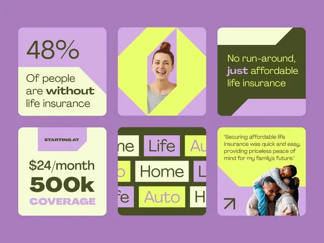
Six-card comparison grid for life insurance products using lavender background with lime-yellow and dark olive geometric color blocking and portrait photography.
Summary
A six-card grid layout comparing life insurance offerings, using bright geometric shapes in lime-yellow and dark olive against a lavender background with photography, statistics, and messaging.
Visual description
Lavender background with a 3x2 grid of equal rounded-corner cards. Top-left: "48% / Of people are without life insurance" split between light cream and lime-yellow geometric shapes. Top-center: Lime-yellow hexagon framing a smiling woman's portrait. Top-right: Dark olive banner with white and lime-yellow text "No run-around, just affordable life insurance." Bottom-left: Cream card with pricing "$24/month" and "500k COVERAGE" in large dark green and purple text on a tilted purple banner. Bottom-center: Dark olive grid showing service categories (Life, Home, Auto) in colored blocks. Bottom-right: Lime-yellow card with customer testimonial quote and family photograph. All text in clean sans-serif, heavy weight for contrast against pastel.
Key takeaway
The complementary color contrast of warm lime-yellow and cool lavender creates energy while remaining professional. Geometric shapes (hexagon, diagonal banners, color blocks) guide hierarchy without borders. Mixing data (statistics, pricing), copy (value proposition), and human photography across cards creates credibility and relatability in equal measure.
Reuse notes
Excellent for fintech, insurance, or financial products targeting a mainstream audience. The pastel palette softens financial anxiety while the geometric blocking keeps information scannable. Works well for comparison/features pages or dashboard landing screens. The color palette may feel too playful for premium/luxury offerings.
More like this




Keep what you find
A free account saves references to boards and can send you a weekly email of picks based on what you save.
To see every result, go Pro.