Preview image. Unlock full-res
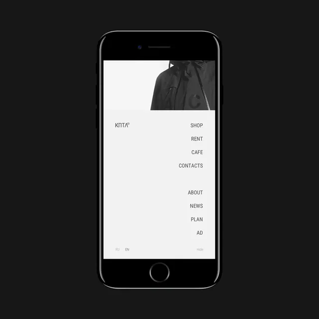
A smartphone mockup displaying a minimalist mobile website interface with a monochrome photographic header and vertical navigation menu.
Summary
A smartphone mockup displaying a minimalist mobile website interface with a monochrome photographic header and vertical navigation menu.
Visual description
The screen features a black and white photograph of a person's shoulder and hood at the top. Below the image, the wordmark 'KNTA' is positioned on the left, while a vertical list of navigation links including 'SHOP', 'RENT', 'CAFE', 'CONTACTS', 'ABOUT', 'NEWS', 'PLAN', and 'AD' is aligned to the right. The layout uses ample white space and clean, all-caps sans-serif typography.
Key takeaway
Use generous white space and asymmetrical text alignment to create a high-end, editorial feel in mobile navigation.
Reuse notes
Apply this layout to luxury fashion or lifestyle brand mobile sites to convey a sense of premium minimalism.
More like this

Keep what you find
A free account saves references to boards and can send you a weekly email of picks based on what you save.
To see every result, go Pro.