Preview image. Unlock full-res
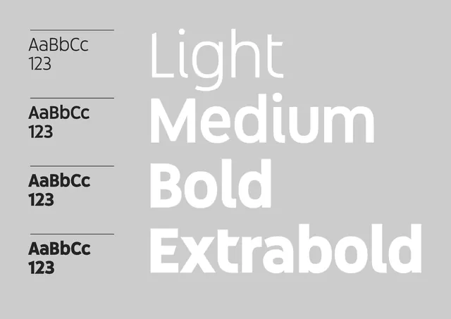
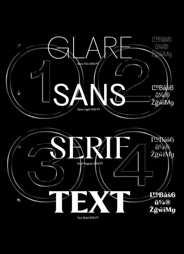
A visual guide showcasing four different weights of a sans-serif typeface.
Summary
A visual guide showcasing four different weights of a sans-serif typeface.
Visual description
The image displays four rows of text on a light gray background. Each row features a sample of 'AaBbCc 123' in a different weight: Light, Medium, Bold, and Extrabold, with the weight name written in a larger size next to it.
Key takeaway
Demonstrates the versatility and visual hierarchy of a single typeface across different weights.
Reuse notes
Use as a reference for establishing typographic hierarchy in a brand identity system.
More like this

Keep what you find
A free account saves references to boards and can send you a weekly email of picks based on what you save.
To see every result, go Pro.