Preview image. Unlock full-res
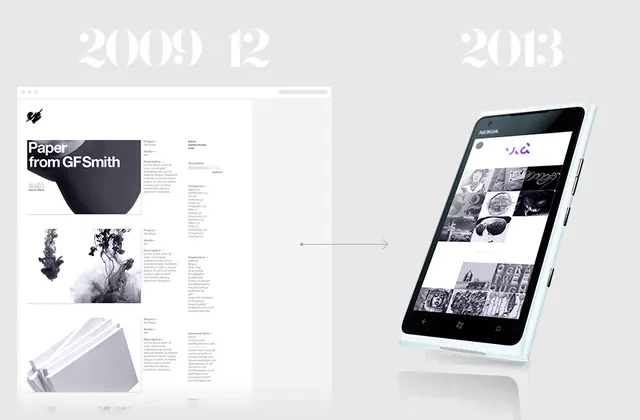
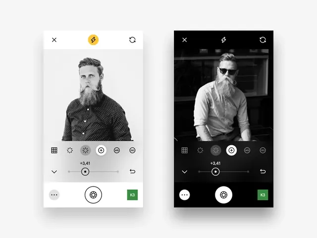
A side-by-side comparison of a digital product interface and its corresponding mobile application mockup, featuring a clean, minimalist layout with dates and descriptive text.
Summary
A side-by-side comparison of a digital product interface and its corresponding mobile application mockup, featuring a clean, minimalist layout with dates and descriptive text.
Visual description
The image shows a desktop UI layout on the left and a mobile phone mockup on the right, connected by a thin arrow. It features large '2009' and '2013' dates at the top with small descriptive text blocks and a grayscale color palette.
Key takeaway
The layout uses ample white space and a clean grid to present a chronological evolution of a digital product.
Reuse notes
Use this layout structure for presenting product iterations or historical design milestones in a portfolio.
More like this

Keep what you find
A free account saves references to boards and can send you a weekly email of picks based on what you save.
To see every result, go Pro.