Preview image. Unlock full-res
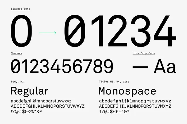
A technical layout comparing 'Regular' and 'Monospace' typefaces, showcasing character sets, numerals, and specific letterforms.
Summary
A technical layout comparing 'Regular' and 'Monospace' typefaces, showcasing character sets, numerals, and specific letterforms.
Visual description
A black and white layout featuring large '0' and '1234' numerals with arrows. It displays full alphabets and number sequences for two different font styles side-by-side.
Key takeaway
The design clearly illustrates the structural differences between proportional and fixed-width typefaces.
Reuse notes
Use as a reference for choosing fonts that require precise alignment or technical clarity.
More like this
Keep what you find
A free account saves references to boards and can send you a weekly email of picks based on what you save.
To see every result, go Pro.