Preview image. Unlock full-res
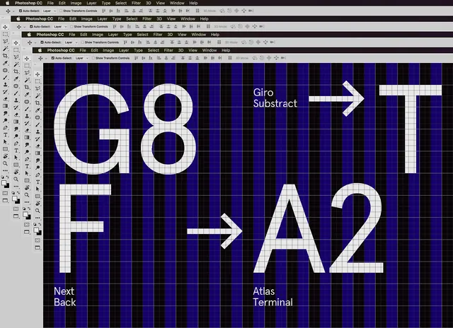
A technical layout comparing various sans-serif typefaces, highlighting specific character shapes and weights against a blue grid background.
Summary
A technical layout comparing various sans-serif typefaces, highlighting specific character shapes and weights against a blue grid background.
Visual description
The image features large white letters and numbers (G8, F, T, A2) set against a dark blue background with a fine white grid. Arrows point between different font examples, accompanied by small labels identifying the typefaces.
Key takeaway
The design effectively uses a grid system to provide a clear, comparative analysis of typographic anatomy.
Reuse notes
Use as a reference for font selection or to demonstrate typographic consistency in a design system.
More like this

Keep what you find
A free account saves references to boards and can send you a weekly email of picks based on what you save.
To see every result, go Pro.