Preview image. Unlock full-res
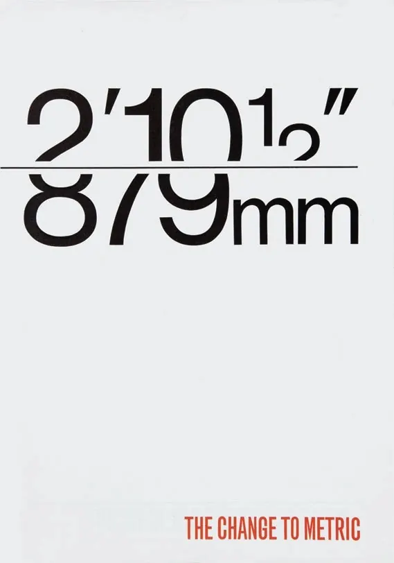
A minimalist typographic layout comparing imperial and metric measurements with a bold horizontal divider.
Typesans-serif, oversized, all-caps
Tagstypography, measurement, conversion, minimalism, grid
Palette
#EBEBEB
#1C1718
#C44E39
Summary
A minimalist typographic layout comparing imperial and metric measurements with a bold horizontal divider.
Visual description
Large black sans-serif numbers and symbols are split by a thick horizontal line, showing imperial units above and metric units below. A small red text label at the bottom right provides context.
Key takeaway
Uses scale and high-contrast typography to communicate a clear data conversion.
Reuse notes
Can be adapted for educational infographics or technical data visualizations.
More like this


Keep what you find
A free account saves references to boards and can send you a weekly email of picks based on what you save.
To see every result, go Pro.