Preview image. Unlock full-res
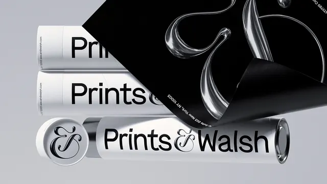
A collection of three distinct typographic treatments for the brand 'Prints & Walsh' displayed on a black background.
Summary
A collection of three distinct typographic treatments for the brand 'Prints & Walsh' displayed on a black background.
Visual description
Three horizontal wordmark variations are stacked vertically. The top two use bold, heavy sans-serif type with a thick underline, while the bottom one features a stylized ampersand and a thinner weight.
Key takeaway
The design demonstrates how varying font weights and decorative elements can alter the brand's visual hierarchy.
Reuse notes
Use as a reference for establishing typographic weight scales and logo lockups.
More like this
Keep what you find
A free account saves references to boards and can send you a weekly email of picks based on what you save.
To see every result, go Pro.