Preview image. Unlock full-res
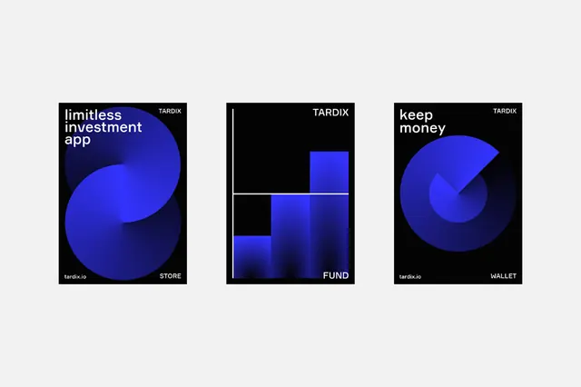
Three dark-mode UI mockups for a Tardix investment app featuring bold electric-blue geometric shapes as abstract brand icons, set against black backgrounds with minimal sans-serif labeling.
Summary
Three smartphone-width mockups labeled Store, Fund, and Wallet showcase Tardix's app screens using electric-blue abstract shapes on black to signal financial products in a high-contrast, minimalist aesthetic.
Visual description
Three vertically-oriented rectangular screens arranged horizontally on a light-gray background. Each screen has a black background, the Tardix logo (white wordmark) at top, and one large electric-blue geometric shape dominating the center: a flowing curved form (left), a grid of overlapping squares (middle), or a pie-chart segment (right). Subtle white dividing lines or secondary blue tones add structure. Product labels (Store, Fund, Wallet) appear in white sans-serif at the bottom in a justified layout. The color contrast is extreme: electric blue against black with white accent type.
Key takeaway
Using a single bold geometric abstraction per screen as a visual icon system, reducing cognitive load while maintaining brand consistency. The black-and-blue high-contrast approach signals security and tech sophistication. Minimal labeling and layout leave the geometry as the hero.
Reuse notes
Excellent for fintech, payments, or investment app landing pages. The abstraction approach works when the product categories (Store, Fund, Wallet) are simple and can each own a distinct geometric metaphor. Dark mode is expected; replicating with light backgrounds would lose impact. Best paired with clear supporting copy and call-to-action.
More like this


Keep what you find
A free account saves references to boards and can send you a weekly email of picks based on what you save.
To see every result, go Pro.