Preview image. Unlock full-res
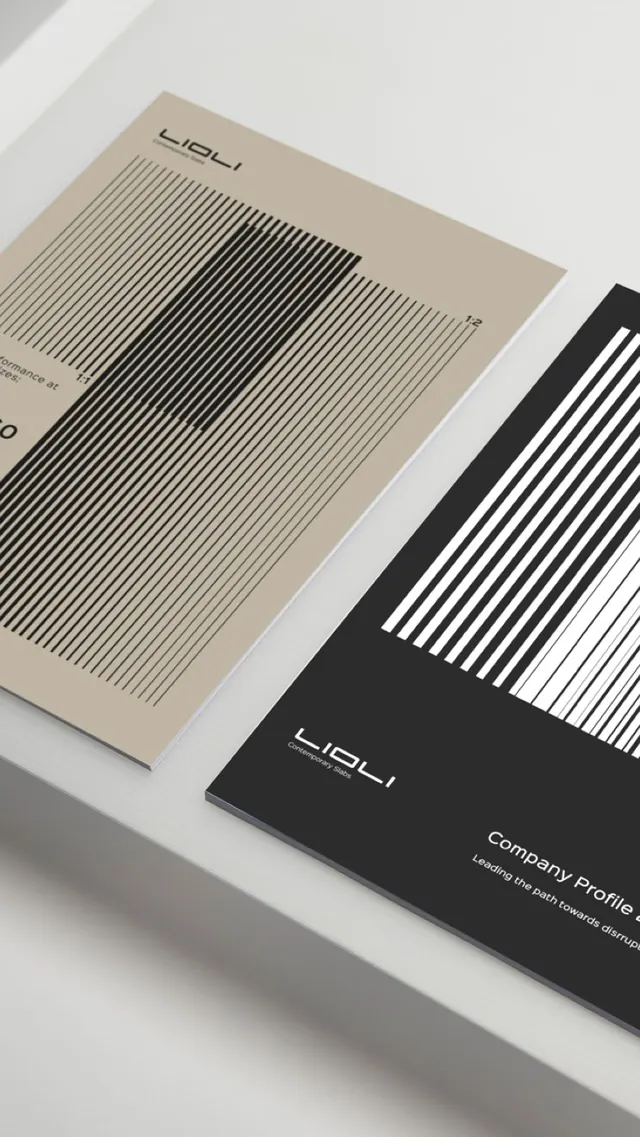
Two-piece corporate identity featuring beige and black brochures with rhythmic vertical striped pattern as the primary visual system.
Summary
Beige and black brochures arranged on white surface, each displaying dense vertical striping as a structural design element with the Lioli logo and supporting sans-serif type.
Visual description
Two folded or closed brochures photographed at an angled overhead view on a neutral surface. The beige brochure (left) has thin black vertical stripes covering roughly the lower two-thirds, fading from dense black lines at top to increasingly thin lines below; the "LIOLI" logo sits crisp and small at the top left in sans-serif. The black brochure (right) mirrors the system in inverse, with white stripes on black, and "LIOLI Company Profile" and "Leading the path towards disruption" visible in white sans-serif type. Overlapping arrangement creates shadow and depth. No photography, illustration, or colour variation; stripe rhythm is the sole graphic system.
Key takeaway
The use of a simple repeating pattern (vertical stripes) as both ornament and structural device. The restraint of limiting the palette to two colours and applying the same geometric language across both pieces. The stripe gradient (dense to sparse) creates visual depth and hierarchy without imagery.
Reuse notes
Works best for B2B, professional services, and design-minded corporate identities. The stripe system is memorable and prints well at scale. Pairs naturally with minimal sans-serif typography and centered or stacked layouts. Requires confident typography to balance the pattern intensity.
More like this





Keep what you find
A free account saves references to boards and can send you a weekly email of picks based on what you save.
To see every result, go Pro.