Preview image. Unlock full-res
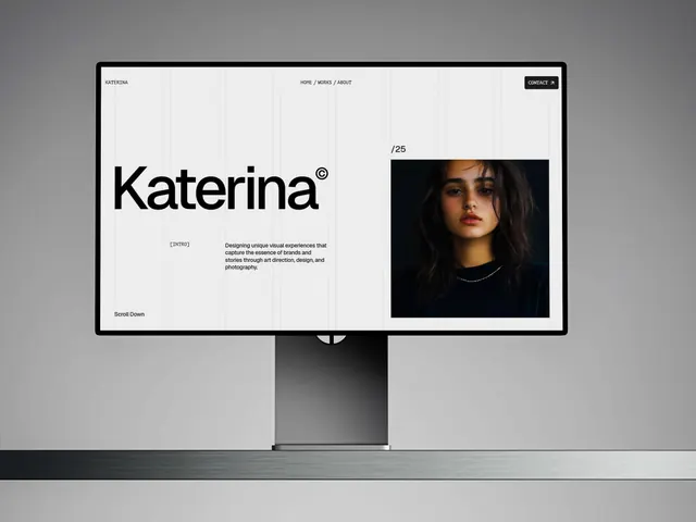
Desktop monitor mockup showing a minimal portfolio site (Katerina) with clean grid structure, bold typography, and a moody portrait photograph anchoring the right panel.
Summary
A desktop monitor mockup displaying a minimalist portfolio website for "Katerina," featuring a large wordmark, monochrome aesthetic, vertical grid guides, and a high-contrast portrait photograph of a woman on the right side.
Visual description
Black-bordered desktop monitor against a neutral background displays a white webpage interior. Top bar has "KATERINA" logotype flush left in serif, navigation links "HOME / WORKS / ABOUT" center-right, and a black "CONTACT" button with arrow far right. Vertical grid lines span the full width, creating a structured modular system. Large "Katerina" logotype with copyright symbol dominates the left-center in bold, modern serif. Below it sits "[INTRO]" label followed by a block of justified body text describing the business ("Designing unique visual experiences..."). "Scroll Down" call-to-action sits at bottom left. Right side features a large, darkly lit portrait photograph of a young woman wearing a chain necklace against black background, labeled "/25" suggesting slide or portfolio position numbering.
Key takeaway
The visible grid overlay as a design documentation device that subtly communicates structure without dominating the page. The split layout anchoring photography on the right while text and branding occupy the left. The serif wordmark paired with grid-based geometric organization for a premium, editorial feel despite minimalism.
Reuse notes
Strong reference for designer or creative-agency portfolio sites where you want to balance typography-forward design with compelling photography. The grid overlay works especially well in case-study or project-showcase layouts. The split-column approach suits portrait-oriented imagery and longer introductory copy.
More like this

Keep what you find
A free account saves references to boards and can send you a weekly email of picks based on what you save.
To see every result, go Pro.