Preview image. Unlock full-res
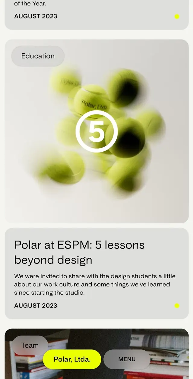
Educational case study layout featuring soft-blurred lime-green orbs as a visual anchor, framed within card-based composition with sans-serif typography.
Summary
A vertical case-study composition for design studio Polar Ltd mixing soft-blurred geometric orbs in lime-green with typography and a numbered badge, framed as card modules on a light-grey background.
Visual description
The layout is a vertical stack of rounded-corner card modules in light grey. Top module: "Education" label in a grey pill badge, followed by a large central focal point of 5-7 soft-blurred circles in lime and charcoal tones, slightly out of focus, suggesting organic movement. A white circle badge with the number "5" overlays the blob cluster. Below: sans-serif body text and metadata ("AUGUST 2023") with a small yellow accent dot. Next module: headline "Polar at ESPM: 5 lessons beyond design" in bold sans-serif, supporting paragraph text, and another "AUGUST 2023" with yellow accent. Bottom module: dark photograph (office/desk context) with overlaid UI elements (grey pill badges labeled "Team", bright-yellow "Polar, Ltda." label, grey "MENU" label). Typography is modern geometric sans-serif in dark charcoal on light grounds.
Key takeaway
The soft, blurred orbs create visual interest and depth without hard edges, suggesting organic process and abstraction. The numbered badge system organizes content cleanly. The lime-to-charcoal gradient on the orbs provides warmth within the neutral palette. Card-module separation keeps narrative readable on mobile.
Reuse notes
Ideal for design agencies, studios, or educational case studies seeking contemporary, approachable tone. The soft-focus abstraction suits creative narratives while remaining professional. The vertical card stack works well for storytelling and responsive layouts. The yellow accent provides subtle contrast without dominating the calm palette.
More like this





Keep what you find
A free account saves references to boards and can send you a weekly email of picks based on what you save.
To see every result, go Pro.