Preview image. Unlock full-res
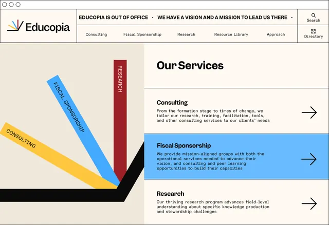
Consulting services webpage layout with diagonal ribbon diagram showing three service categories stacked at different angles on a beige background.
Summary
Consulting services webpage layout with diagonal ribbon diagram showing three service categories stacked at different angles on a beige background.
Visual description
The left side features a beige/cream background with a diagonal-stacked ribbon chart in yellow, blue, and burgundy/black, each ribbon labeled with a service name rotated to match its angle (Consulting, Fiscal Sponsorship, Research). The right side displays the services as a content grid with headline "Our Services", sections for Consulting, Fiscal Sponsorship, and Research with body copy and right-pointing arrows. A horizontal top navigation bar appears across the page showing "EDUCOPIA IS OUT OF OFFICE" messaging with service categories. The overall palette is warm earth tones with bright blue and deep burgundy accents.
Key takeaway
The diagonal ribbon infographic as a visual table of contents, with each ribbon's angle and color reinforcing its category without labels. The left-right split between visual diagram and content hierarchy. The single right-arrow icon for each section as a subtle call-to-action.
Reuse notes
Excellent for multi-service B2B or consulting sites where visual hierarchy must be clear and memorable. The diagonal treatment adds dynamism to what could be a flat list. Works best when service count stays at 3 or fewer (more gets cluttered).
More like this









Keep what you find
A free account saves references to boards and can send you a weekly email of picks based on what you save.
To see every result, go Pro.