Preview image. Unlock full-res
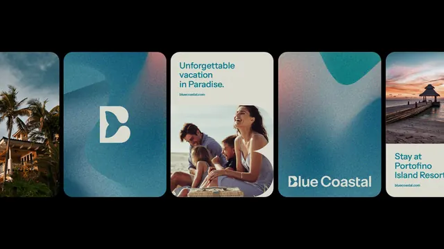
Carousel of five rounded-corner cards with cohesive teal-to-gold gradient palette, lifestyle photography, and minimal text overlay.
Summary
Carousel of five rounded-corner cards with cohesive teal-to-gold gradient palette, lifestyle photography, and minimal text overlay.
Visual description
Five square cards arranged horizontally with rounded corners (approximately 16px radius). Each card combines a color gradient (teal shifting to warm sand/gold) layered over lifestyle photography (palm trees, couples at beach, pier at sunset, aerial resort view). Text is sparse: a logo ("B" mark), headline ("Unforgettable vacation in Paradise"), subheadline ("Stay at Portofino Island Resort"), all in clean sans-serif, positioned in upper-left or lower-right corner with high contrast against the image. Black bar above and below the row frames the composition.
Key takeaway
The consistent gradient-to-photo layering that unifies diverse imagery into a single brand experience. The minimal typography allows photography to lead while maintaining brand hierarchy. Rounded corners and soft-focus images together signal premium leisure and escape.
Reuse notes
Effective template for travel/hospitality marketing (resort, vacation rental, tour operator). Works well in promotional carousels, hero sections, or email campaigns. Pair with a stronger single CTA (booking button) when used in conversion contexts. Photography quality is critical; soft-focus works here but demands clean, well-composed originals.
More like this



Keep what you find
A free account saves references to boards and can send you a weekly email of picks based on what you save.
To see every result, go Pro.