Preview image. Unlock full-res
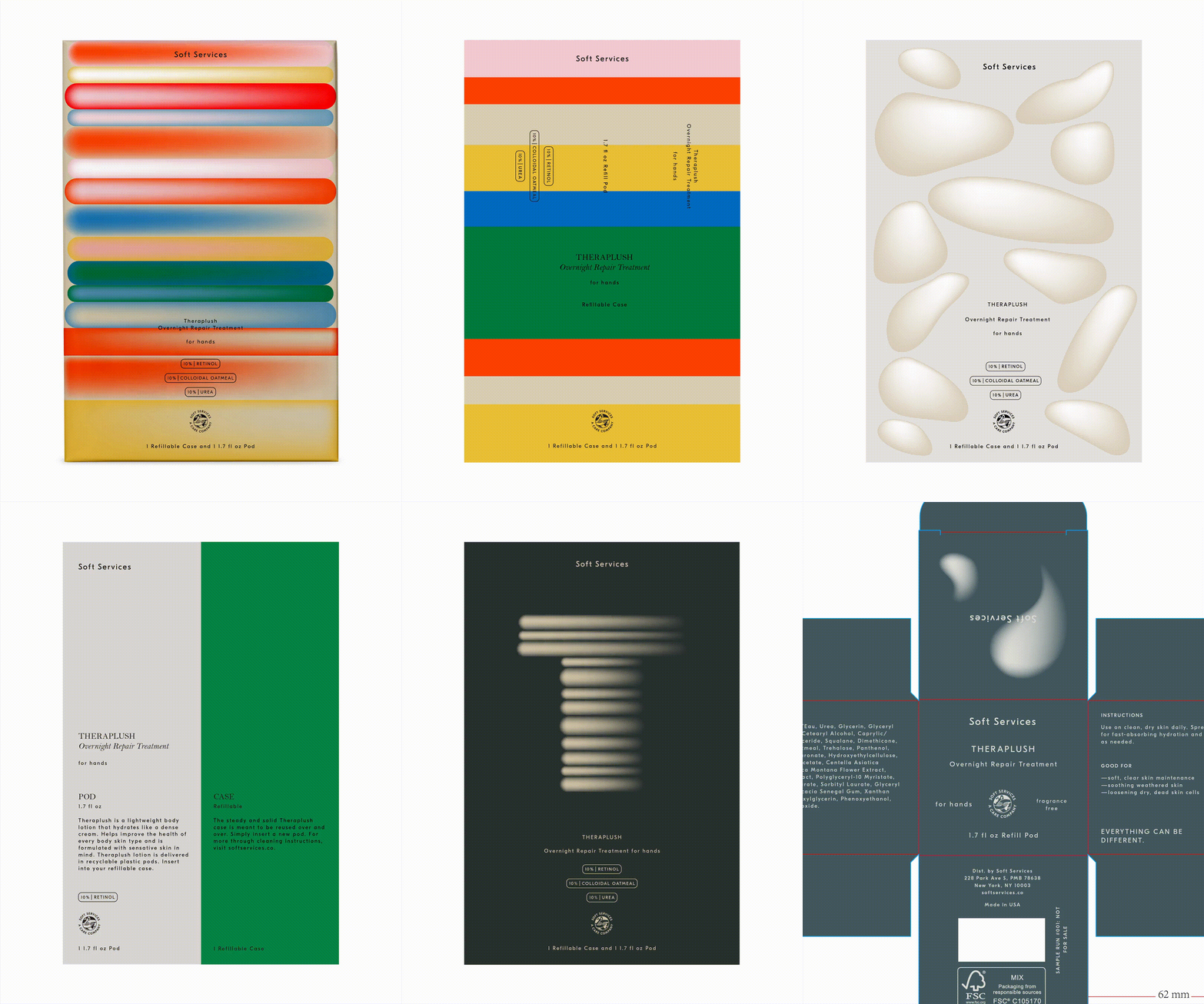
Vertical product packaging mockup with stacked horizontal bars in warm gradients (orange, gold, red, blue) and ingredient callouts for a spa or skincare line.
Summary
Vertical product packaging mockup with stacked horizontal bars in warm gradients (orange, gold, red, blue) and ingredient callouts for a spa or skincare line.
Visual description
A tall rectangular packaging mockup (portrait orientation) filled with nine stacked horizontal bars, each a rounded-end gradient band in distinct warm and cool tones: coral-to-white, pale gold-to-white, bright red, muted blue, coral, white, orange, and dark teal-to-white gradients. A "Soft Services" label appears in serif type at the top. Lower third contains three stacked text callouts in outlined pills: "10% Retinol", "10% Colloidal Oatmeal", "10% Urea". At the bottom sits a circular logo and product name "Theraplush Overnight Repair Treatment for hands" with "1 Refillable Case and 1 1.7 fl oz Pad" descriptor. The gradient bars suggest multiple treatment tiers or benefits; the color coding aids product recognition at shelf. Overall tone is serene and premium.
Key takeaway
The use of stacked horizontal bars as both a visual and functional container: each bar represents a different product benefit or ingredient tier, creating a visual hierarchy without text-heavy layouts. The soft gradients on each bar add depth and premium feel while remaining minimal. The ingredient callouts in outlined pills keep information readable without clutter.
Reuse notes
Excellent for premium skincare, spa, or wellness product packaging. The stacked-bar system scales well for product lines with multiple variants or ingredient tiers. Color gradients work best on portrait packaging (refill pods, skincare jars, lip balms); less suitable for horizontal formats. The pastel-to-vibrant gradient palette reads as both playful and professional, common in contemporary skincare branding.
More like this




Keep what you find
A free account saves references to boards and can send you a weekly email of picks based on what you save.
To see every result, go Pro.