Preview image. Unlock full-res
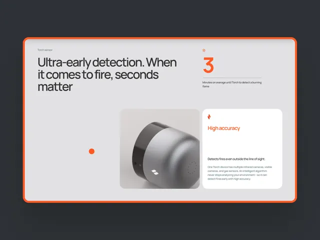
A dark slate background displaying a smart fire-detection device in 3D render, flanked by a bold orange-bordered information card highlighting ultra-early detection benefits.
Summary
A hardware product marketing graphic showing a spherical smart fire-detection device centered in a composition, with an orange-framed information card anchoring a key benefit ("Ultra-early detection. When it comes to fire, seconds matter") and a secondary callout ("High accuracy").
Visual description
Dark charcoal background (nearly black). A compact 3D-rendered cylindrical device with a dark matte finish sits in the center-right, rendered with subtle shading to show dimension and premium materiality. To the left, a large red circular dot (accent marker) floats as a visual anchor point. The left side features a bold orange border forming a card or frame, containing a headline in heavy sans-serif ("Ultra-early detection. When it comes to fire, seconds matter") paired with body copy. To the right, a smaller white card with orange accent bar displays another claim ("High accuracy") and supporting descriptive text in fine print. The overall asymmetric composition uses the orange accent line to guide the eye and unify the layout.
Key takeaway
The orange accent color acts as a navigation and emphasis tool across a dark neutral background. The asymmetric layout (device center, text left and right) creates dynamic balance without symmetry. The pairing of a large product render with concise benefit statements and supporting details follows a proven structure for high-value hardware pitches.
Reuse notes
Excellent for security, IoT, or hardware product marketing. The dark background conveys technical confidence and premium positioning. The orange accent works for urgency or calls to safety/attention but can be swapped to match brand color. Works at mobile width; copy is legible and hierarchy is clear. Better for landing pages and spec sheets than for packed landing experiences.