Preview image. Unlock full-res
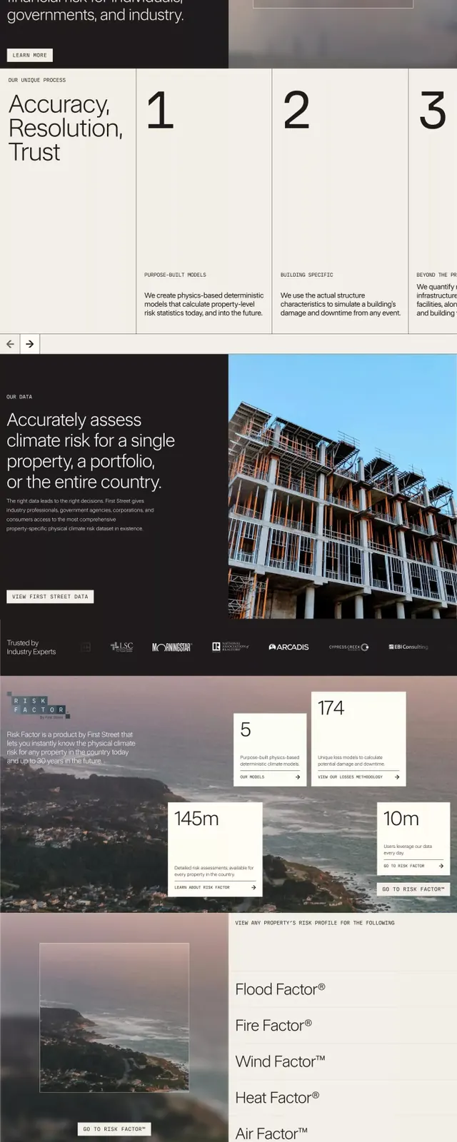
A dark-mode fintech web interface visualizing climate risk assessment with atmospheric imagery, numbered callout cards, and structured typography.
Summary
A multi-section fintech web experience blending atmospheric photography, numbered list sections, and measured typographic hierarchy to communicate climate risk assessment and insurance data.
Visual description
The layout stacks five distinct sections across a light-to-dark vertical narrative. Top: a full-bleed environmental photograph of a river-cut landscape with a bold white headline ("First Street is the industry-leading physical climate risk data provider") overlaid at left, accompanied by a small card with logo and subtext. Middle: a dark charcoal panel with white body text setting strategic context ("We exist to make the connection..."). Below: three numbered cards (1, 2, 3) on white background with black sans-serif headings, sub-copy, and spacious layout. Lower: a dark panel with a modern office building photograph and call-to-action, followed by five metric rows (145m, 10m, statistics in light-on-dark). Final section: numbered callout boxes overlaid on a landscape photograph with beige and cream accent cards. Footer shows partner logos in a grid. Typography uses sans-serif throughout: display weight for headlines, regular for body; color palette cycles between off-white, deep charcoal, and warm beige accents.
Key takeaway
The numbered-list structure as a trust-building device in fintech: each card isolates a concept and gives it visual weight. Alternating light and dark sections manage cognitive load across a long-form page. Atmospheric imagery paired with data-dense content signals authority without coldness. The warm beige accent appearing in cards and overlays softens an otherwise austere palette.
Reuse notes
Well-suited to climate tech, insurance, financial-risk, and B2B analytics platforms. The heavy use of photography and measured color transitions works for longer landing pages or multi-step pitch decks. Avoid if the data itself needs to dominate (this style is opinionated and takes up visual real estate); better for narrative-driven persuasion than dense data tables. Works best with real environmental or architectural photography.
More like this




Keep what you find
A free account saves references to boards and can send you a weekly email of picks based on what you save.
To see every result, go Pro.