Preview image. Unlock full-res
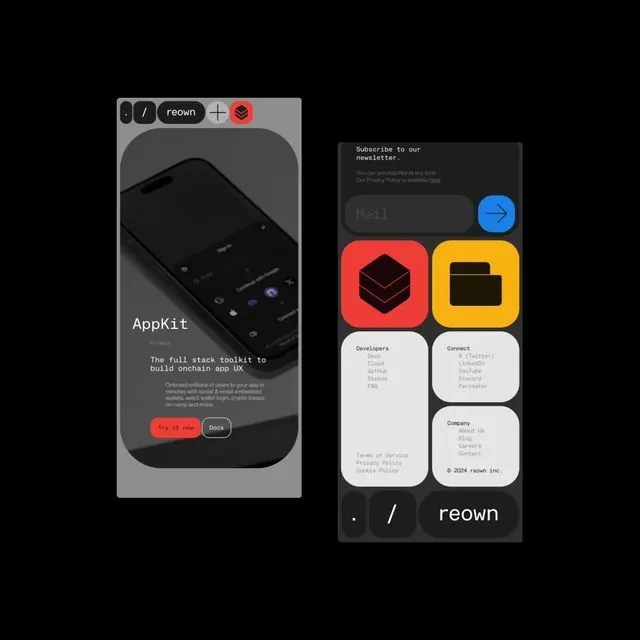
Product mockup layout pairing a smartphone interface on the left with a modular card grid featuring red, yellow, and white components on a dark background.
Summary
A tech-focused marketing mockup showing a dark-theme mobile app toolkit, with a smartphone preview on the left and a 3x2 grid of component cards featuring bright red, yellow, and white accent colors on the right.
Visual description
On the left, a smartphone mockup with a dark interface and minimal UI elements. On the right, six component cards arranged in a grid: a blue send icon on dark; a large red square with a 3D geometric shape; a bright yellow folder icon; and three white cards with gray text, developer links, and company information. The top of the image shows a dark header with MacOS-style window controls, tabs labeled "reown," and a close button. A dark horizontal bar at the bottom displays the brand name "reown" in white alongside a forward slash. The entire composition sits on pure black with tight spacing.
Key takeaway
The contrast of bright saturated accent colors (electric red, golden yellow) against pure black and white creates maximum visual pop. The modular card grid with consistent spacing is scannable and emphasizes component reusability. The smartphone mockup positioned to the left balances the taller card stack on the right.
Reuse notes
Ideal for developer tools, design systems, or SaaS products targeting technical audiences. The dark background requires bright accent colors to avoid feeling flat. Works well for product marketing when paired with a demo or feature overview. The mockup approach (showing the app alongside component cards) makes it suitable for landing pages or presentations.
More like this

Keep what you find
A free account saves references to boards and can send you a weekly email of picks based on what you save.
To see every result, go Pro.