Preview image. Unlock full-res
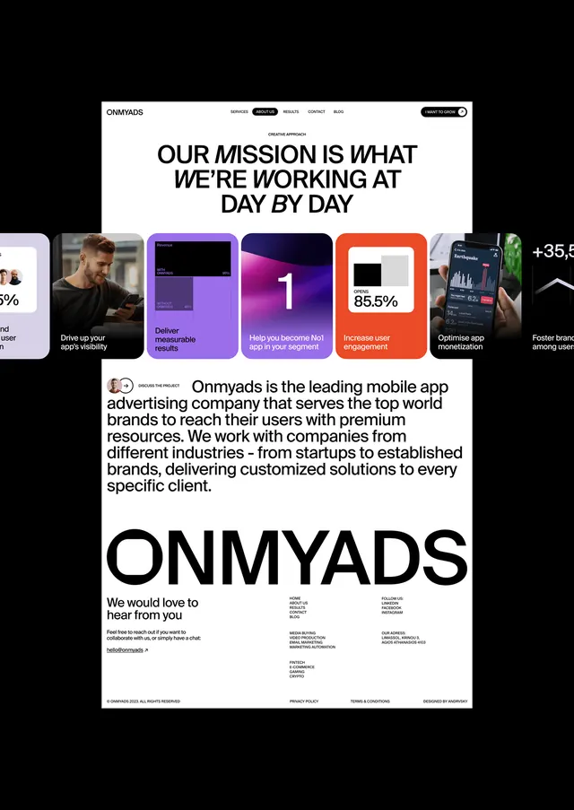
Black background with a stark mission statement headline, colorful metric cards (purple, blue, orange, green), company description, and secondary team/testimonial cards.
Summary
A dark pitch-deck or marketing page for Omnyads (a mobile advertising app) built around a bold mission statement, supporting metric cards, company description, and secondary content cards in a strict high-contrast grid.
Visual description
Jet-black background with centered white sans-serif headline reading "OUR MISSION IS WHAT WE'RE WORKING AT DAY BY DAY" in all-caps. Below, a row of four colorful rectangular cards: purple, blue, orange, and green, each showing a metric or key stat (percentages, icons, brief labels). The company logo and description sit centered below the cards. A secondary section shows the company name "ONMYADS" in large, bold white type with a short body paragraph and contact/social information. The cards vary in color saturation but maintain equal weight in the grid. All typography is tight, modern, and sans-serif; white space is minimal, maximizing density on the dark field.
Key takeaway
The color-card trick: instead of bars or icons, full-bleed colored rectangles with bright accent colors on black create instant visual hierarchy and draw the eye. The mission statement as the lead (before the metrics) sets narrative first, then proof. The density of the layout communicates seriousness; no breathing room equals "we mean business."
Reuse notes
Strong pattern for app-marketing, consulting pitches, or fintech decks where you want confident, data-forward positioning. The card colors could be swapped to match brand guidelines. Best when the metric values are meaningful (percentages, growth figures, user counts). Avoid if your brand voice is playful or relaxed; this is all confidence and authority.
More like this



Keep what you find
A free account saves references to boards and can send you a weekly email of picks based on what you save.
To see every result, go Pro.