Preview image. Unlock full-res
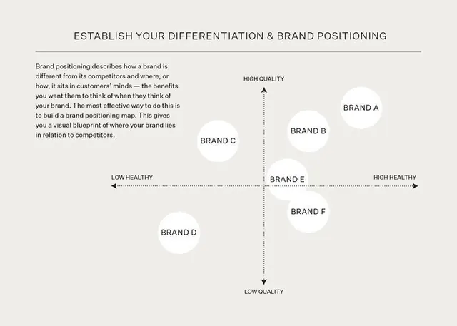
Two-axis brand positioning chart mapping six brands by quality and health perception, rendered in minimal monochrome.
Summary
Two-axis brand positioning chart mapping six competing brands by quality vs. health perception, rendered in minimal monochrome lines and circles.
Visual description
A 2x2 positioning matrix with vertical axis labeled "HIGH QUALITY" to "LOW QUALITY" and horizontal axis "LOW HEALTHY" to "HIGH HEALTHY". Two perpendicular dotted lines divide the canvas into four quadrants. Six white circles represent competing brands (Brand A, B, C, D, E, F), each positioned to show competitive standing. A block of explanatory body copy sits to the left, defining brand positioning as a strategic tool. All typography is crisp sans-serif in dark gray; the composition uses minimal color (light beige background, medium gray gridlines and text, white brand circles).
Key takeaway
The clarity of axis labels and quadrant arrangement makes strategic relationships immediately legible. Using white circles as brand placeholders keeps the diagram abstract and reusable; the body-copy sidebar anchors the abstract chart in narrative context.
Reuse notes
Effective for business presentations, brand strategy decks, and competitive analysis in pitch materials. The monochrome treatment reads professional and data-driven; adapt to include brand logos inside circles or add supporting callouts. Works well in PDFs and print.
More like this



Keep what you find
A free account saves references to boards and can send you a weekly email of picks based on what you save.
To see every result, go Pro.