Preview image. Unlock full-res
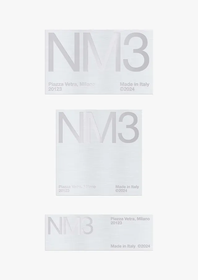
Three minimalist card designs showing the NM3 wordmark at different sizes with consistent layout and Italian address details.
Summary
Three variations of a minimal business card design featuring a large NM3 wordmark in grey with consistent address and copyright information.
Visual description
Three rectangular cards arranged vertically, each showing the NM3 wordmark in large grey sans-serif type at different scales and positions. Each card includes text reading "Piazza Vetra, Milano 20123" and "Made in Italy" with a copyright mark. The cards are light grey on a very light background, with subtle variation in wordmark opacity and size. Text is rendered in a small, elegant sans-serif. The entire composition is monochromatic in cool greys with very high contrast minimized through tonal subtlety.
Key takeaway
The systematic exploration of scale and positioning within a constrained stationery format, showing how the same elements can be arranged differently while maintaining visual coherence. The minimal palette relies on typographic hierarchy rather than color.
Reuse notes
Effective for design system documentation or stationery mockups. The three-card comparison format is useful for presenting design alternatives. Works well in digital portfolios or as a spec sheet. The subtle grey-on-grey approach is sophisticated but requires high-quality printing or screen display to be effective. Best used when showing restrained, luxury brand identity work.
More like this



Keep what you find
A free account saves references to boards and can send you a weekly email of picks based on what you save.
To see every result, go Pro.