Preview image. Unlock full-res
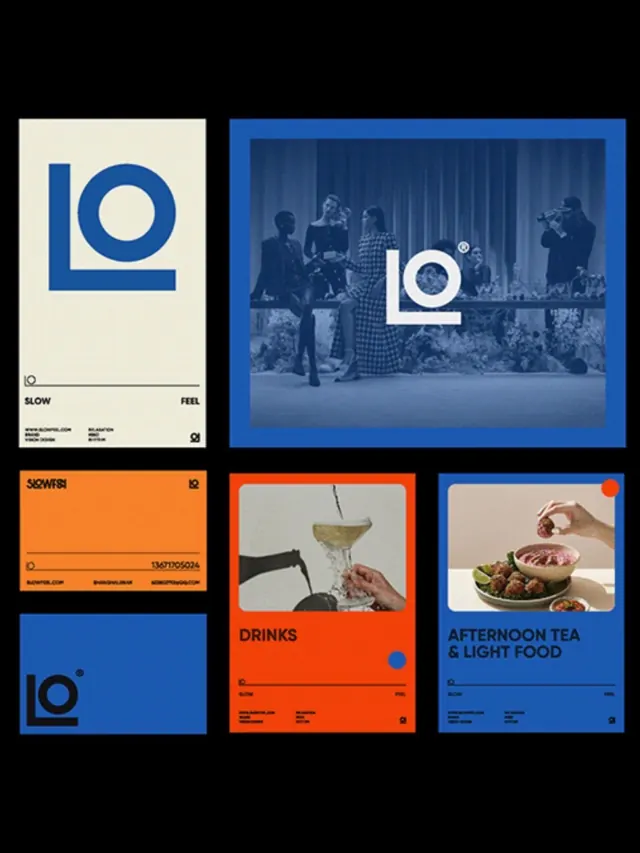
LO geometric logo mark with cohesive identity system applied across printed collateral, signage, and photography.
Summary
LO geometric logo mark applied across collateral, signage, and photography, showing a bold identity system balancing blue, burnt-orange, and cream.
Visual description
Six compositions arranged in a grid showcase a cohesive brand identity: a primary stationery letterhead with a bold blue geometric "LO" square mark and minimal black text; a blue branded signage board with the mark and photography of people in styled light-filled space; an orange business card labeled "SLOW FEEL" with geometric accent; a photography-forward lifestyle card labeled "DRINKS" with burnt-orange field and photographic hero; a soft-toned card labeled "AFTERNOON TEA & LIGHT FOOD" in blue with photographed food and hand gesture; and a solid blue business card with the LO mark alone. The system uses a tight color palette (navy blue, burnt-orange, cream, and black) applied consistently across print formats.
Key takeaway
The logo mark is strong enough to anchor each format alone, allowing the system to breathe. Photography treatment (soft color cast, lifestyle framing) is consistent across all applications. Strategic color blocking (blue and orange as primaries) creates visual cohesion without repetition; cream and black provide structure and contrast.
Reuse notes
Strong model for food, hospitality, or lifestyle brands building a cohesive print identity. The use of photography as a narrative element (not just decoration) and the restrained color palette work well across multiple touchpoints. Geometric mark scales down well to small sizes (business cards, signage).
More like this




Keep what you find
A free account saves references to boards and can send you a weekly email of picks based on what you save.
To see every result, go Pro.