Preview image. Unlock full-res
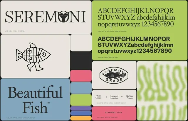
Brand identity specimen with serif and sans-serif typefaces displayed on a geometric grid of lime green, blue, coral, and neutral modular cards.
Summary
Brand identity specimen with serif and sans-serif typefaces displayed on a geometric grid of lime green, blue, coral, and neutral modular cards.
Visual description
A systematic brand layout arranged in a grid on white background. Top-left: "SEREMONI" wordmark in elegant serif with a stylized fish icon. Below it: a minimalist line-drawn fish icon in black on white. To the right: lime green panel showing serif and sans-serif character sets with "Store Norse Gangster Regular" label. Center and lower sections contain labeled color swatches (blue, charcoal, coral, lime) with callout text ("Wild Caught", "Humanely Harvested", "Ike Lime Process") and repeated wavy green organic pattern on the right edge. Bottom pink band contains "SEREMONI.FISH" branding.
Key takeaway
The modular card system allows type and color samples to breathe while maintaining a cohesive layout. The combination of a geometric grid with organic wavy pattern creates visual interest without chaos. The icon-based approach to brand communication (fish as primary mark) is simple and memorable.
Reuse notes
Strong template for seafood, food, or nature brands needing a contemporary yet trustworthy identity. The color palette is friendly and earthy, suitable for sustainable or artisanal narratives. Works well for packaging, labels, and digital applications.
More like this



Keep what you find
A free account saves references to boards and can send you a weekly email of picks based on what you save.
To see every result, go Pro.