Preview image. Unlock full-res
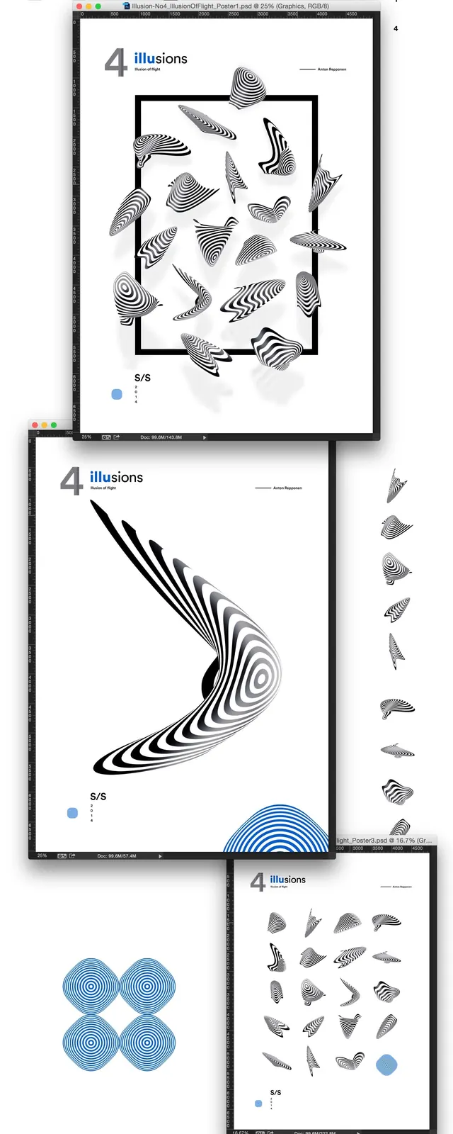
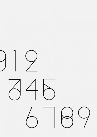
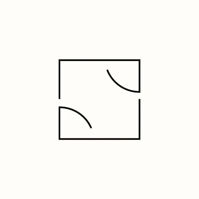
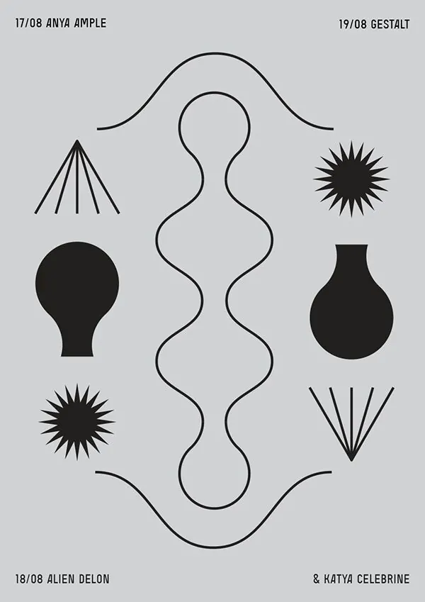
A minimalist black-and-gray poster composition with symmetrical organic outlines and geometric burst shapes on a light gray background.
Summary
A minimalist black-and-gray poster composition with symmetrical organic outlines and geometric burst shapes on a light gray background.
Visual description
The image shows a light gray poster with small all-caps text in the corners and a vertical central outline made from a continuous black line. Around it are six black motif shapes, including starbursts, fan-like rays, a bulb-like silhouette, and curved line forms arranged symmetrically across the page.
Key takeaway
Use a single repeated line language to unify otherwise varied shapes, then place bold black forms against generous empty space for strong figure-ground contrast. Keep the composition centered but slightly asymmetrical so it feels controlled without becoming static.
Reuse notes
Reach for this when you want a minimal poster, identity, or editorial graphic that relies on shape rhythm rather than imagery. It works well for abstract concept pieces, design systems, and prints where visual tension matters more than literal illustration.