Preview image. Unlock full-res
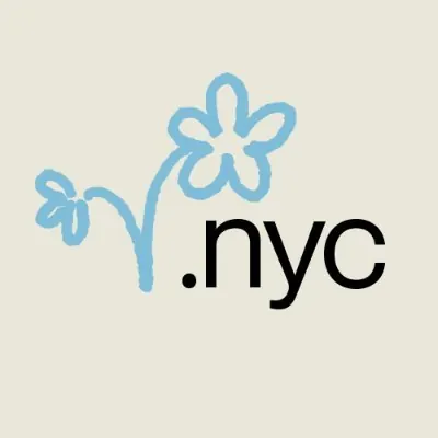
Domain branding logo pairing bold sans-serif .NYC wordmark with hand-drawn blue flower illustration on cream background.
Summary
Domain branding logo pairing bold sans-serif .NYC wordmark with hand-drawn blue flower illustration on cream background.
Visual description
A minimal square composition on soft cream background. Upper half features two blue hand-drawn flowers with organic, curved petals connected by a simple curved stem. The smaller flower sits on the left, larger flower arcs to the right. Lower half contains bold black sans-serif type reading ".nyc" with period and extension clearly emphasized. The sketch-like illustration style of the flowers contrasts gently with the geometric precision of the wordmark, creating warmth while maintaining clarity and authority for a domain brand.
Key takeaway
Pairing illustrative, organic forms with geometric type for dimensional interest. The hand-drawn quality makes corporate domain branding feel approachable and human. The use of a simple two-color palette (blue and black) on neutral ground creates visual cohesion without complexity.
Reuse notes
Effective for local/regional branding, tech community initiatives, or when you need a corporate entity to feel friendlier and more playful. The sketched illustration lifts the .nyc domain from being purely utilitarian. Works as a logo mark, application icon, or web badge.
More like this






Keep what you find
A free account saves references to boards and can send you a weekly email of picks based on what you save.
To see every result, go Pro.