Preview image. Unlock full-res
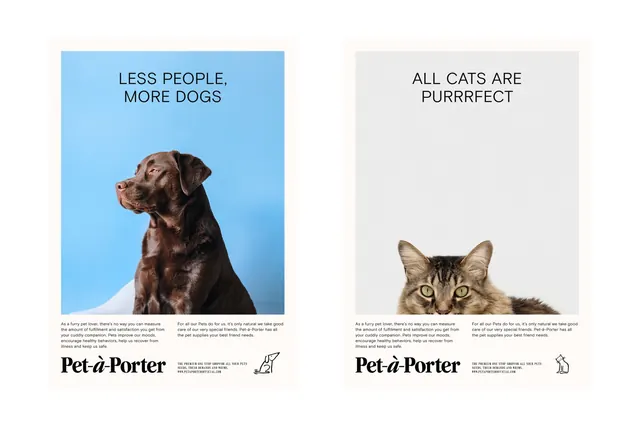
Side-by-side promotional cards for a pet brand featuring a brown lab on light blue and a tabby cat on light gray, each with playful headlines and body copy.
Summary
Two contrasting promotional cards for Pet-à-Porter: a brown Labrador under "LESS PEOPLE, MORE DOGS" on light blue, and a tabby cat under "ALL CATS ARE PURRRFECT" on light gray, each with supporting copy and brand footer.
Visual description
Left panel: chocolate-brown dog portrait centered on pale blue background with all-caps headline in dark sans-serif, three lines of descriptive body text in small type at bottom, Pet-à-Porter logotype and trademark below. Right panel: tabby cat head shot on light gray-beige background with identical compositional structure, reversed headline in same typeface, matching body text layout, matching brand signature. Both cards share uniform padding, sans-serif type hierarchy (large headlines, smaller body, tiny footer text), and a balanced center-to-bottom information density. Photography is direct, well-lit, and cropped just above the subject's shoulders.
Key takeaway
The symmetrical card-pair format with intentional color differentiation (blue vs. gray) to separate two distinct product angles while maintaining visual consistency through identical layouts and typography. The use of animal portraiture and punchy, personality-driven copy (not generic product speak) to create emotional connection. The minimal footer treatment that preserves the calm, uncluttered feel.
Reuse notes
Works well for dual-offering brand campaigns (pro-dog, pro-cat; either/or messaging) or lifestyle retail where personality drives purchase intent. The format scales to more than two cards by repeating the pattern. Best paired with quality, properly-lit product or subject photography.
More like this





Keep what you find
A free account saves references to boards and can send you a weekly email of picks based on what you save.
To see every result, go Pro.