Preview image. Unlock full-res
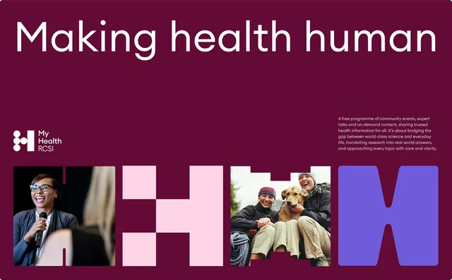
Deep maroon poster layout introducing My Health RCS, a free healthcare communication program, with modular typography and photographic montage of people and speaker.
Summary
A healthcare nonprofit poster introducing My Health RCS, a free community health program, using bold maroon background, modular white typography, and a multi-image collage of people engaged in health conversations and outdoor activities.
Visual description
Deep maroon background with oversized white sans-serif headline "Making health human" at top. Left side features layered photographic elements: a speaker at a microphone in glasses, a blurred background figure, a checkered pink/maroon shape, and a cheerful outdoor moment of a child and adult with a dog. Right side shows pink accent areas and bright blue-violet geometric shapes (likely representing the brand identity letters or modules). Logo "My Health RCS" appears in white with geometric mark at left-center. Descriptive text block in light gray appears at top-right, explaining the program as community events and expert health information for bridging science and everyday life.
Key takeaway
The maroon-pink-blue color trio creates distinctive high-contrast brand identity; the modular geometric letterforms work as both visual system elements and graphic anchors; the photo collage humanizes healthcare without needing a single hero image.
Reuse notes
Works well for nonprofits and healthcare brands targeting community engagement. The deep maroon reads premium and trustworthy while the vibrant pink accents signal approachability. Requires strong photography to make the collage feel intentional rather than scattered.
More like this


Keep what you find
A free account saves references to boards and can send you a weekly email of picks based on what you save.
To see every result, go Pro.