Preview image. Unlock full-res
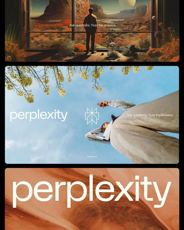
Three horizontal cards demonstrating a unified brand identity through consistent wordmark and geometric icon applied across complementary warm and cool color schemes.
Summary
Three horizontal cards demonstrating a unified brand identity through consistent wordmark and geometric icon applied across complementary warm and cool color schemes.
Visual description
Three stacked rectangular cards, each with distinct photographic background and color treatment. Top card: warm, earthy desert landscape (terracottas and oranges) with silhouette figure facing monumental formations; overlay text reads "Ask questions. Trust the answers." Middle card: bright sky-blue background with drooping golden foliage, white "perplexity" wordmark, thin geometric icon mark, repeating text. Bottom card: warm sand/terracotta tone with large white "perplexity" wordmark filling most of the frame. A thin geometric mark appears consistently across cards, anchoring the identity system. The spacing and proportions remain balanced across all three variations.
Key takeaway
The discipline of applying a single wordmark and mark across multiple color modes (warm, cool, warm again) to prove systematic flexibility. The photographic backdrops remain distinct but subordinate to type and mark. The geometric icon functions as a visual anchor.
Reuse notes
Effective for brand guidelines, pitch decks, or identity showcases. Works when you have access to varied photographic textures and can afford to give type dominant real estate. The warm-cool-warm rhythm creates visual interest without feeling chaotic.
More like this


Keep what you find
A free account saves references to boards and can send you a weekly email of picks based on what you save.
To see every result, go Pro.