Preview image. Unlock full-res
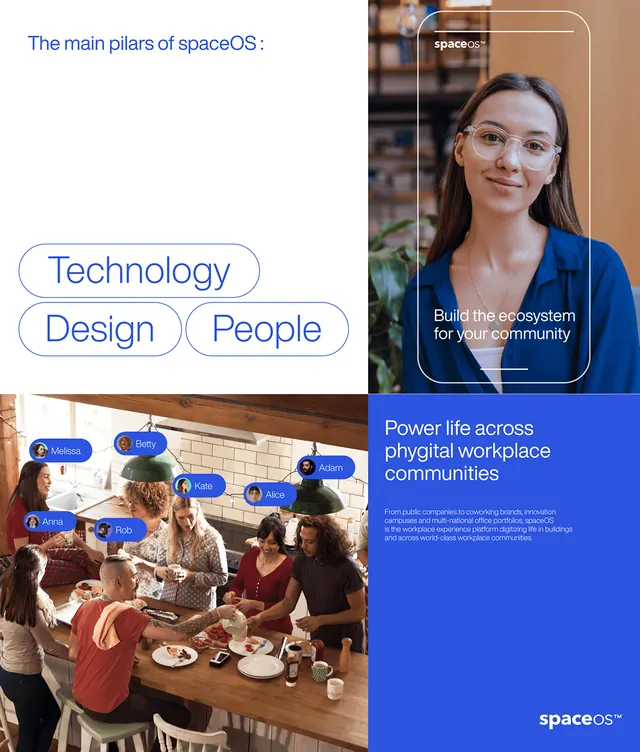
Brand identity explainer for spaceOS showing core pillars (Technology, Design, People) with portraits and lifestyle photography on a deep-blue background.
Summary
A brand identity pitch for spaceOS that organizes its mission into three pillars (Technology, Design, People) and demonstrates community values through diverse portraits and collaborative lifestyle photography.
Visual description
The composition stacks four content blocks vertically on a white left panel and saturated indigo-blue right panel. Top left states "The main pillars of spaceOS:" in blue sans-serif, followed by three pill-shaped outlined buttons: "Technology," "Design," and "People." Below, a portrait of a woman in professional blue clothing appears right-aligned on the blue panel with overlaid caption "Build the ecosystem for work, play and growth." The bottom half shows a warm lifestyle photo of collaborative dining and conversation, with a blue banner overlay reading "Power life across physical workplace communities" and the spaceOS logo. The color palette pairs bright white, deep indigo, warm skin tones, and brown accents, creating high contrast and visual hierarchy.
Key takeaway
The modular pillar structure as a simple framing device for brand values. The strategic use of white space on the left and saturated color on the right to separate information from lifestyle proof. Lifestyle photography integrated as evidence, not decoration, reinforcing community values.
Reuse notes
Effective for SaaS or community-focused B2B brands introducing core values and differentiators. The left-text, right-image split works well for pitch decks and brand primers. Works best when lifestyle photography genuinely reflects the stated values rather than feeling stock or generic.
More like this



Keep what you find
A free account saves references to boards and can send you a weekly email of picks based on what you save.
To see every result, go Pro.