Preview image. Unlock full-res
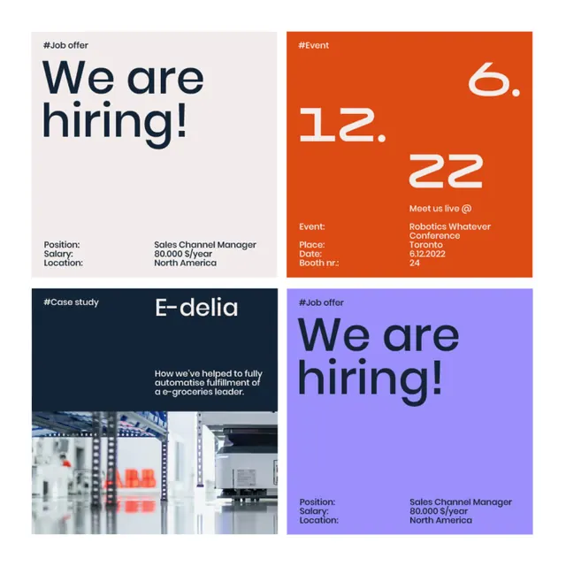
Four-card grid mixing recruitment and event content with bold type, bright accents (orange, purple), and white space on soft backgrounds.
Summary
A 2x2 grid of promotional cards advertising job openings and a company event, each with a bold single-color background (light, orange, dark navy, or purple) and large sans-serif headlines.
Visual description
Top left: pale beige card with "We are hiring!" headline, job details (position: Sales Channel Manager, salary range, location: North America). Top right: bright orange card with "12. 22" date and event title "Robotics Whatever Conference", with linked tagline "Meet us live @" and additional event info. Bottom left: dark navy card with "#case study" label, E-delta client name, and supporting text about work completed, with a partial image of what appears to be industrial/manufacturing facility. Bottom right: bright purple card with "We are hiring!" headline and matching job position, salary, and location information. All cards use clean sans-serif typography with ample white space and a minimal information hierarchy. No imagery except the case study card.
Key takeaway
The bold single-color background approach making each card instantly scannable by topic (hiring, event, case study). The mixing of vibrant accent colors (orange, purple) without cluttering; the high contrast between type and background drives legibility and visual impact. The symmetric grid layout with consistent padding creates order and professionalism even with mixed content types. Large, confident headlines prioritize the primary message.
Reuse notes
Effective for corporate multi-message campaigns or internal communications where audience needs to quickly parse different information types (hiring, events, case studies). Works best when content is brief and headlines are punchy. Requires high-contrast color choices to work; pastels risk reducing readability. Scales well to 3x3 or other grid sizes while maintaining the rhythm.
More like this


Keep what you find
A free account saves references to boards and can send you a weekly email of picks based on what you save.
To see every result, go Pro.