Preview image. Unlock full-res
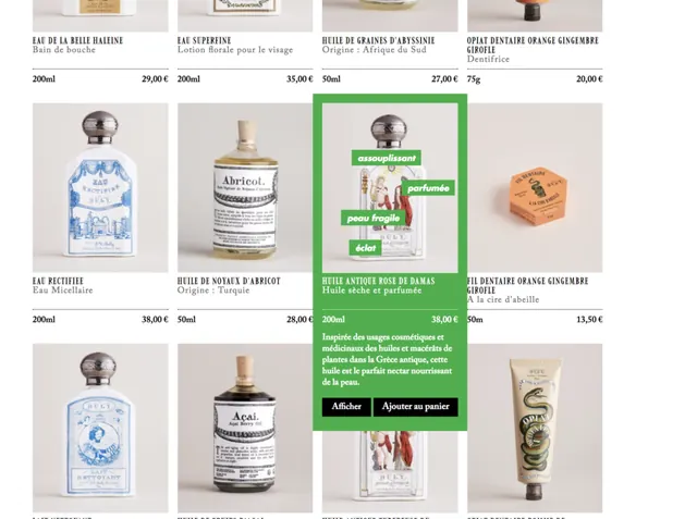
A grid-layout product catalog for cosmetics and skincare featuring clear glass bottles, natural materials, green accent bars, and minimalist serif typography on a neutral beige background.
Summary
A luxury beauty catalog organized in a four-column grid showcasing glass bottles, jars, and tubes for cosmetics and skincare products, unified by neutral beige tones, clear packaging photography, and bright green accent bars highlighting featured items.
Visual description
The layout presents eight product images in a 4x2 grid on a soft neutral background. Each product card includes a centered product shot of glass bottles or cream jars photographed against light backgrounds, with handwritten-style product names and prices below. Two green horizontal accent bars span across the grid, labeling featured sections in white text and creating visual breaks. The overall color story relies on transparent glass, warm wood and metal closures, natural cream and beige hues, with accent green used sparingly but strategically for emphasis. Typography mixes clean sans-serif for product information with serif accents, reinforcing a sophisticated, refined aesthetic.
Key takeaway
The strategic use of a single accent color (green) applied as horizontal bars rather than scattered throughout prevents visual noise while creating natural scanning points. Pairing clear glass product photography with a neutral warm background allows the actual product to be the hero without competing background elements. The consistent grid structure combined with variable-height accent bars creates rhythm within constraint.
Reuse notes
Ideal for luxury beauty, skincare, or apothecary brands targeting a natural, refined, premium market. Works well for print catalogs, digital lookbooks, or e-commerce grid displays where product clarity and purity are key selling points. The warm neutral palette pairs well with photography-heavy layouts; keep background negative space generous to avoid visual clutter with this many product variations.
More like this




Keep what you find
A free account saves references to boards and can send you a weekly email of picks based on what you save.
To see every result, go Pro.