Preview image. Unlock full-res
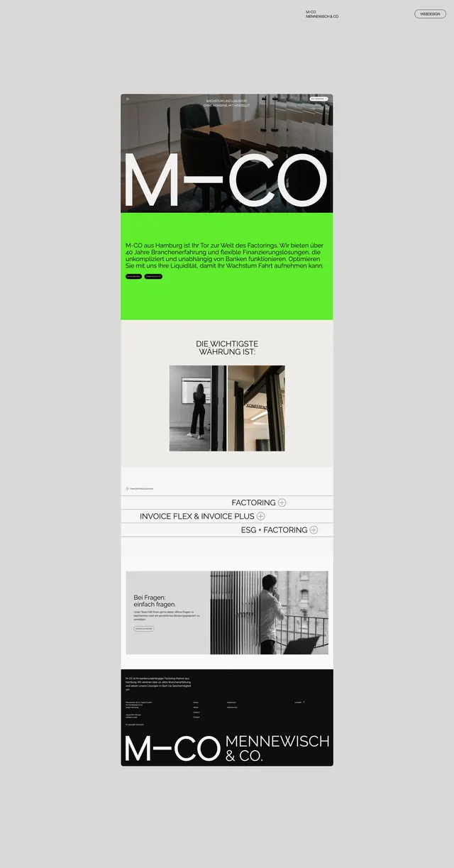
A corporate landing page for a Hamburg factoring company (M-CO) with a bright lime accent stripe and modular layout presenting services, documentation, and staff photos.
Summary
A corporate landing page for a Hamburg-based factoring firm (M-CO Mennewisch & Co.) using a lime-green accent stripe to break up a minimal black-and-white grid layout of services, benefits, and company imagery.
Visual description
A scrolling page layout starting with a light gray header containing the company name "M-CO MENNEWISCH.CO" and "Wirkungsvoll" button top-right. The hero features a dark photograph of an office interior partially masked behind large white sans-serif "M-CO" letterforms, with a bright lime-green rectangular panel underneath containing German body copy and two black button-style elements. Below, a light section with a right-aligned subheading "DIE WICHTIGSTE WAHRUNG IST:" (The most important value is) accompanied by a cropped black-and-white photograph of a person at a doorway. A series of service modules follow: "Factoring", "Invoice Flex & Invoice Plus", and "ESG + Factoring", each with info icons. A later section pairs a left-aligned black-and-white photograph of a person at a window with a striped vertical relief graphic and right-aligned body copy titled "Bei Fragen, einfach fragen" (Any questions, just ask). The footer features a black background with white sans-serif logo "M-CO MENNEWISCH & CO." and footer navigation links.
Key takeaway
The lime-green accent panel breaks visual monotony in a restrained black-white-gray palette without feeling garish. Using cropped, off-centered photography maintains interest while the generous negative space preserves professionalism. Service modules (Factoring, Invoice variants) are clearly separated into scannable chunks with small icon indicators.
Reuse notes
Effective for B2B service or financial-services landing pages where trust and clarity are primary. The bright accent works particularly well for younger or tech-forward finance brands. Photography of people in workplaces (doorways, windows, offices) adds human connection without product shots. Reserve the lime for calls to action or key information sections only.
More like this


Keep what you find
A free account saves references to boards and can send you a weekly email of picks based on what you save.
To see every result, go Pro.