Preview image. Unlock full-res
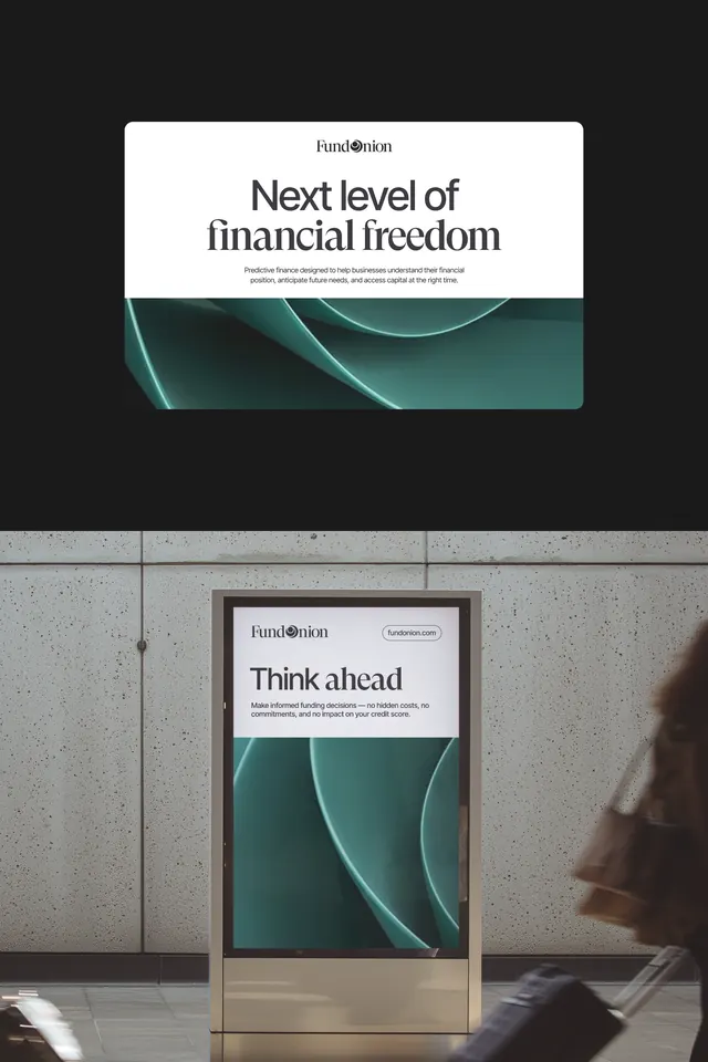
Fintech identity system for FundMotion pairing sans-serif headline typography with fluid, curved teal wave graphics on white and dark backgrounds.
Summary
FundMotion fintech branding showing headlines paired with flowing curved teal-green shapes, displayed as both screen mockup and physical billboard signage.
Visual description
Two layouts of the same brand system: a digital mockup above shows a white card with FundMotion mark, headline "Next level of financial freedom", subtext, and a curved teal wave graphic filling the lower third. Below it, a photograph of a physical billboard on a concrete exterior shows the same system (headline "Think ahead", subtext, same teal wave) on a portrait-oriented poster mounted to a facade. Both use sans-serif typography (likely geometric, all black), arranged hierarchically with the mark at top, headline dominant, small body text, and the graphic element occupying roughly one third of the vertical space. The teal element is a nested curve, not a solid shape, creating rhythm and suggesting movement or flow. The color interaction is teal on white backgrounds and white on dark gray or black backgrounds.
Key takeaway
The fluid curved form works as both a visual accent and a directional element (suggests growth or momentum). The system scales cleanly from screen to physical signage without losing identity. The monochromatic plus one accent (teal) palette is financial-credible and clean. The hierarchy (mark, headline, secondary text, graphic) is immediately legible at any scale.
Reuse notes
Ideal for fintech, investment, or wealth-management brands. The flowing graphic suggests forward movement without being too playful. Works on both dark and light backgrounds. The clean typography and minimal color palette are economical for multi-channel rollout. Billboard-scale test shown here proves legibility at distance.
More like this




Keep what you find
A free account saves references to boards and can send you a weekly email of picks based on what you save.
To see every result, go Pro.