Preview image. Unlock full-res
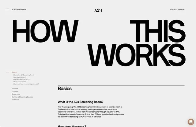
Minimalist educational landing page using bold oversized typography and systematic navigation to explain an exclusive film-screening membership experience.
Summary
The hero section of A24's Screening Room membership landing page, using stacked oversized headlines and vertical left-aligned content blocks to teach how an exclusive film experience works.
Visual description
Light gray-white background with modular layout. Top-left corner contains hamburger menu labeled "SCREENING ROOM" with A24 logo centered at top and login/signup navigation top-right. Main content features "HOW" and "THIS WORKS" stacked as separate lines in extra-bold sans-serif, scaled to dominate the viewport. Below at smaller scale, a vertical navigation list includes "Basics," "Account," "Ticketing," "Screenings," "Casting & Streaming Devices," and "Technical." Right-hand column begins explanatory body text with a "Basics" section heading, followed by questions and answers about the screening experience. A small red feedback button floats bottom-right.
Key takeaway
The stacked headline breaking a compound statement across lines for visual impact and scannability. The systematic use of left-aligned vertical navigation paired with expandable content sections. The generous white space around large type creates perceived elegance and professionalism without decoration. Minimal branding (single logo, no color) keeps attention on information.
Reuse notes
Ideal for membership, educational, or feature-rich platforms where users need clear orientation and step-by-step guidance. The tall vertical proportions suit desktop experiences with substantial content depth. Works well for cultural institutions, premium services, and documentation-heavy onboarding. High-contrast monochrome treatment ensures accessibility and timeless polish.
More like this


Keep what you find
A free account saves references to boards and can send you a weekly email of picks based on what you save.
To see every result, go Pro.