Preview image. Unlock full-res
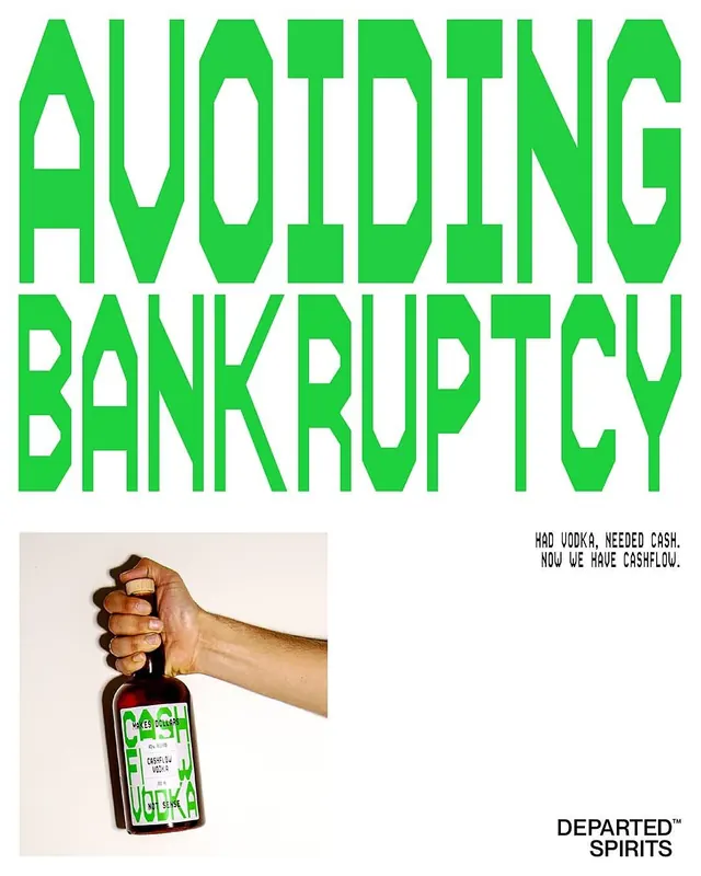
Lime-green two-line display headline 'AVOIDING BANKRUPTCY' towers above a photograph of a fist gripping a vodka bottle with a green and white label, paired with dry wit copy right-aligned.
Summary
A spirits brand uses oversized lime-green all-caps type to state a conditional financial joke ("AVOIDING BANKRUPTCY") above a photograph of a brown-skinned fist gripping a dark glass bottle, with droll copy in the lower right ("HAD VODKA, NEEDED CASH. NOW WE HAVE CASHFLOW.").
Visual description
White background dominates. The entire top third is occupied by "AVOIDING BANKRUPTCY" in massive, geometric lime-green sans-serif capitals with thick strokes and angular letterforms. Below, a photograph shows a right-pointing fist holding a dark spirits bottle; the bottle's label is white with green text and hand-drawn lines mimicking a hastily drafted financial plan. The label reads "DEPARTED SPIRITS" with doodles suggesting accounting charts and cash-flow notation. In the lower right, black uppercase sans-serif copy reads "HAD VODKA, NEEDED CASH. NOW WE HAVE CASHFLOW." The brand name "DEPARTED SPIRITS" appears below the image in the same black type. The photograph's skin tone and the dark glass bottle ground the humor in a tangible product moment.
Key takeaway
Overlaying oversized type above a product photograph creates immediate communicative punch without need for additional background color. The lime-green-on-white color contrast is impossible to ignore and feels youthful, playful, and anti-corporate. The humorous conditional statement (financial struggle as product origin story) inverts typical marketing flattery and creates memorable, shareable narrative. Geometric sans-serif letterforms are strong enough to hold their own against photographic elements.
Reuse notes
Excellent template for spirits, beverages, or consumer goods marketing that embraces humor and candor over aspirational messaging. The high contrast and oversized typography work at small digital sizes (social, thumbnails) and large print. The directional composition (left-to-right gaze, fist pointing into frame) creates dynamic asymmetry. Best suited to brands with irreverent positioning; corporate or premium spirits would clash with this tone. The hand-holding creates product intimacy that lifestyle photography often lacks.
More like this

Keep what you find
A free account saves references to boards and can send you a weekly email of picks based on what you save.
To see every result, go Pro.