Preview image. Unlock full-res
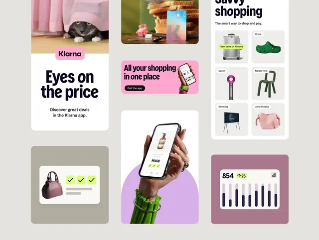
Multi-panel marketing collage for Klarna pay-later app featuring cat imagery, app screenshots, lifestyle product photography, brand partner grid, and transaction dashboard with pink and purple accents.
Summary
Multi-panel marketing collage for Klarna pay-later app featuring cat imagery, app screenshots, lifestyle product photography, brand partner grid, and transaction dashboard with pink and purple accents.
Visual description
A composition of six distinct marketing modules arranged in an asymmetric grid layout. Top left shows a white card with "Eyes on the price" headline, a cat photo, and subheading "Discover great deals in the Klarna app" with a pink label. Top center displays a mobile mockup with pink background showing "All your shopping in one place" with app download CTA. Top right shows a grid of six product brand logos and product photography (furniture, clothing, appliances). Middle left features a pale beige card with a handbag photo and green checkmarks. Bottom left shows a purple-background circle with hands holding a mobile app screenshot. Bottom right displays a muted-mauve dashboard card with "854" as a key metric, an upward arrow, and a bar chart. The overall palette is light gray background with white cards, pink, purple, green, and natural product photography.
Key takeaway
The mixed-content grid strategy that communicates multiple value propositions (deals, brands, ease, security, stats) without feeling cluttered. The use of pink and purple accent blocks to break up white space and create visual destination points. The real product photography paired with flat UI elements creates trust while maintaining design playfulness. The handbag checkmark card demonstrates security/validation in a literal, memorable way.
Reuse notes
Excellent template for fintech, ecommerce, and subscription app marketing. The modular structure lets you swap content blocks while keeping the composition balanced. The pastel accent colors (pink, purple) appeal to lifestyle and retail audiences. Works especially well for "compare features" or "why choose us" sections. The cat imagery is brand-specific, but the principle of humanizing through relatable imagery (pets, people in lifestyle settings) applies broadly.
More like this

Keep what you find
A free account saves references to boards and can send you a weekly email of picks based on what you save.
To see every result, go Pro.