Preview image. Unlock full-res
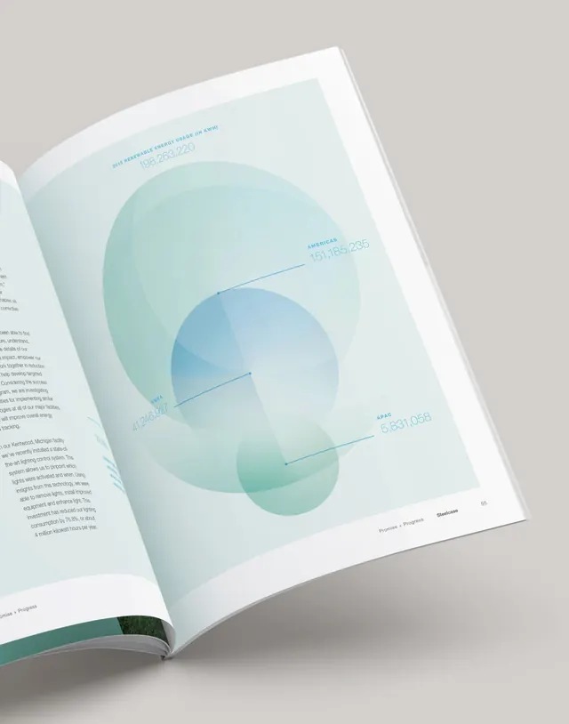
Print report spread featuring overlapping teal and mint gradient circles with labeled data metrics, demonstrating soft-color data visualization within editorial layout.
Summary
A printed report page showcasing energy-usage or consumption data via three overlapping, gradient-filled circles in layered teal and mint, with needle-point labels anchoring specific metrics.
Visual description
The page is photographed as an open spread in a bound report. Left margin shows body copy in small gray type. The right page dominates: a light cream-mint background with three large, semi-transparent circles filled with radial gradients from pale mint (outer) to deeper teal (center). The largest circle anchors the composition; two smaller circles overlap it, creating depth through transparency and gradient shifts. Three labeled data points (with numerical values) are marked with thin lines pointing to specific circle regions: "2026 renewable energy usage (in kWh)" at top, "americas" and "APAC" callouts below, plus "EMEA" notation. All type is a clean, modern sans-serif in light gray or teal on the pale background. The binding edge curls the page slightly, adding a photographic, tactile dimension. Overall mood is calm and approachable, avoiding harsh contrast or aggressive graphics.
Key takeaway
The gradient-circle overlay technique creates intuitive containment (each metric lives within a shape) without needing borders or boxes. The soft mint-to-teal spectrum is visually cohesive and readable. Layering transparent shapes generates pseudo-depth on a flat page. The unlabeled (minimal text) approach lets the visual hierarchy breathe. The soft, muted palette keeps data visualization accessible rather than data-chart clinical.
Reuse notes
Strong for sustainability reports, energy/utility companies, and B2B analytics presentations. Works in print and digital (use transparency/blend modes). The soft palette suits calm, trustworthy subjects. If your data needs high contrast or urgent attention, this style can feel too quiet. Pairs well with dense paragraph copy and serves as a visual break in text-heavy documents. Works better for summary-level metrics than granular dashboards.
More like this




Keep what you find
A free account saves references to boards and can send you a weekly email of picks based on what you save.
To see every result, go Pro.