Preview image. Unlock full-res
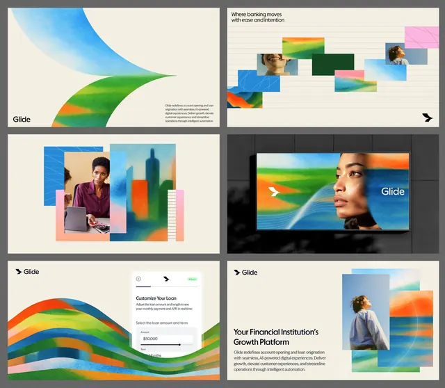
Fintech product showcase with flowing, multi-color gradient shapes and layered photography creating a sense of movement and accessibility.
Summary
A fintech product showcase pairing flowing, multi-color gradient ribbons with photographs of diverse users and UI elements to convey ease and accessibility.
Visual description
Six panels arranged in a grid showing Glide's brand identity and product design language. Top left features smooth, curved gradient shapes in teal, green, and orange transitioning across a cream background. Top right uses a collage technique: overlapping rectangular photograph crops (portraits, hands, architecture) with colorful gradient blocks underneath, all aligned to a loose grid on a striped background. Center left combines a large photograph of a woman with a tablet, surrounded by stacked, offset shape layers in pink, blue, and green. Center right displays a widescreen product screenshot with the same flowing gradient shapes composited over a portrait photo. Bottom left shows a form interface (loan amount selector) with gradient stripes flowing beneath. Bottom right pairs a portrait photograph with layered gradient rectangles, the word "Glide" in cream text.
Key takeaway
The layering technique of flowing gradient shapes as a structural foundation under photography, creating visual unity across disparate content. The color palette choice (cool primaries + warm accents) as an accessible, modern alternative to flat single-color gradients. The systematic reuse of curved, wave-like forms across UI and marketing collateral for brand consistency.
Reuse notes
Strong for fintech, financial software, and payments platforms aimed at modern audiences. The flowing shapes effectively soften corporate rigidity while maintaining professionalism. Works well when product screenshots need a branded frame or when mixing UI mockups with people-focused photography. Requires confident color and photographic choices to pull off effectively.
More like this





Keep what you find
A free account saves references to boards and can send you a weekly email of picks based on what you save.
To see every result, go Pro.