Preview image. Unlock full-res
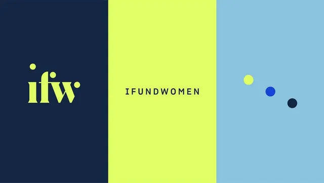
Tripartite vertical split in navy, lime, and sky blue anchored by a minimal sans-serif logo and brand name on the left.
Summary
Tripartite vertical split in navy, lime, and sky blue anchored by a minimal sans-serif logo and brand name on the left.
Visual description
Three equal vertical sections fill the canvas: dark navy on the left holds an outlined yellow logo (with floating dot accents) and serif brand type; bright lime-green dominates the center with black serif brand text; light sky-blue on the right carries three floating circles (yellow, blue, dark navy) as accent marks. The geometry is rigid and modular, creating instant visual separation across brand applications.
Key takeaway
The pure color-blocking strategy creates instant brand differentiation without imagery or detail. The floating geometric accents (circles) add visual rhythm while staying minimal. Use when you need a color system that reads distinctly across contexts (print, web, signage).
Reuse notes
Effective for women-focused nonprofits, advocacy brands, and professional networks seeking bold, unforgettable color identity. Works at any scale because the division is mathematical. Ensure the brand mark is legible on the lightest zone; here the yellow serif holds strong against navy and lime but may fade on sky blue.
More like this



Keep what you find
A free account saves references to boards and can send you a weekly email of picks based on what you save.
To see every result, go Pro.