Preview image. Unlock full-res
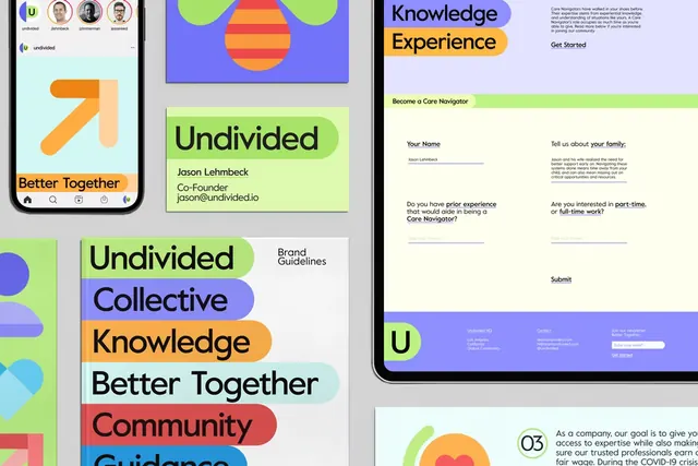
Modular card layout in purple, lime, orange, and blue showing brand identity, values, and knowledge resources for a community platform.
Summary
Modular card layout in purple, lime, orange, and blue showing brand identity, values, and knowledge resources for a community platform.
Visual description
A collage of card layouts: upper-left shows a tilted orange arrow and heading "Better Together"; center-top is a bright lime-green block with "Undivided" title and sub-leadership text; right side displays a light lavender card with "Knowledge Experience" header (yellow label) and body copy; left side stacks color-blocked bars reading "Undivided", "Collective", "Knowledge", "Better Together", "Community", "Guidance" in alternating hues (purple, orange, lime, blue, red, blue). A web mockup shows the same values layered on an information page. Each card or bar uses a single background color paired with black serif headline and gray body type. The layout demonstrates how the same brand values can be chunked into cards, stacked lists, or web blocks.
Key takeaway
The modular card system allows the same content to be rendered multiple ways (isolated card, stacked text bar, web content block) while maintaining the color-value mapping. The color-blocking strategy makes each concept instantly recognizable by hue. Pair bold sans-serif headlines with gray body copy for readable hierarchy within tight cards.
Reuse notes
Ideal for nonprofit and community-focused brands sharing core values or guiding principles. The modular approach scales from a poster to a web page. Ensure each color is used consistently per concept (e.g., purple always equals "Undivided", lime always equals "Collective") so users build instant visual recognition. Works especially well when values are short, punchy keywords.
More like this



Keep what you find
A free account saves references to boards and can send you a weekly email of picks based on what you save.
To see every result, go Pro.